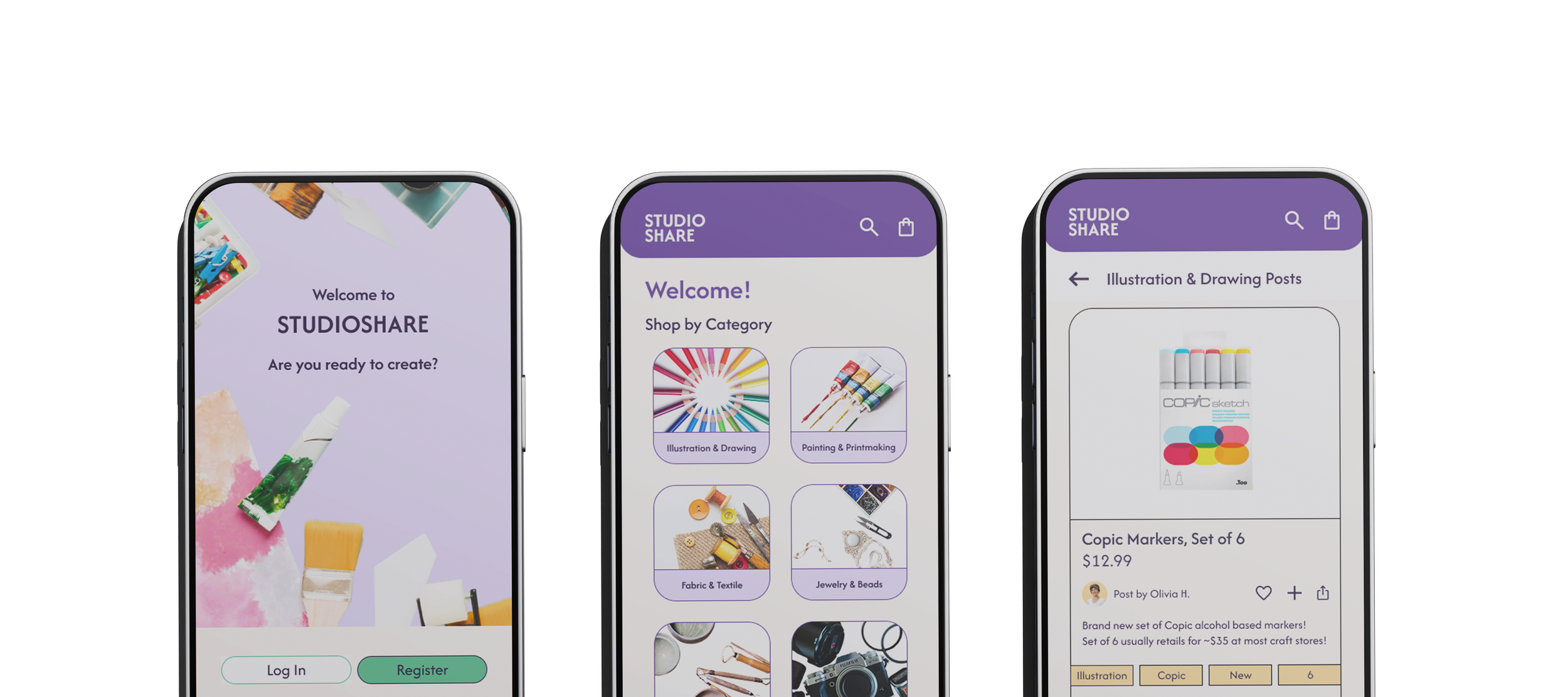
Studioshare App
UX UI | App/Mobile Design
Interaction design studio project focused on developing a fictional mobile app identity to solve a need.
Background Research
Quantitative research reveals the extent of material inequity in creative education: 94% of public school teachers purchase supplies with personal funds, averaging $479/year (Education Week, 2018) [3]. Freelancers and students face similar barriers—MNaito writes that a single quality brush can cost over $150, and paper up to $5/sheet [1]. Backpacks USA highlights how “donated art supplies allow students to experiment and develop their artistic talents without being limited by their school’s budget” [2]. The research supports Studioshare’s core mission: to build a circular, trust-based system for creative equity.
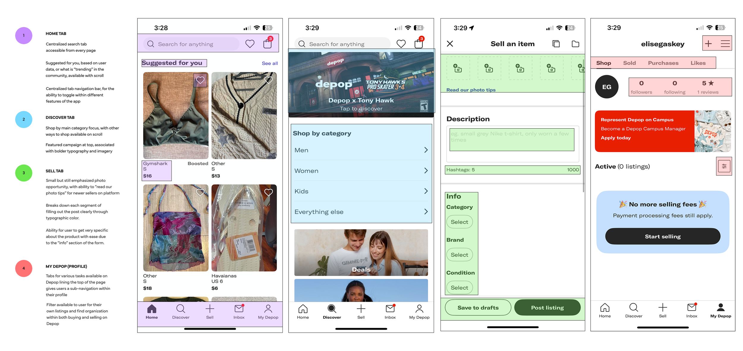
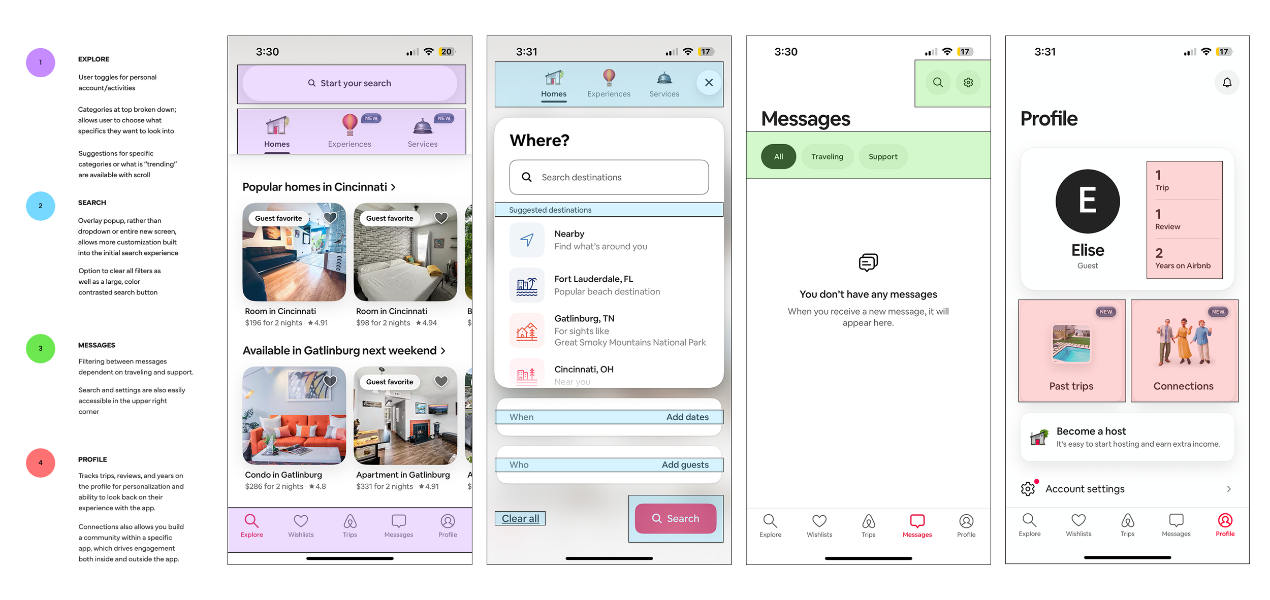
Benchmarking
Why?
Access to creative materials remains a significant barrier within both K–12 and higher education. In many underfunded schools, students lack basic art supplies, limiting early exposure to creative exploration. This issue persists into college-level programs, where the high cost of materials, even for essential items, restricts students’ ability to fully participate in their disciplines. As a result, talent development, creative confidence, and educational equity are directly affected. By connecting users through a streamlined exchange system, Studioshare aims to expand material access, support creative practice, and foster a more equitable artistic community.
Depop
Airbnb
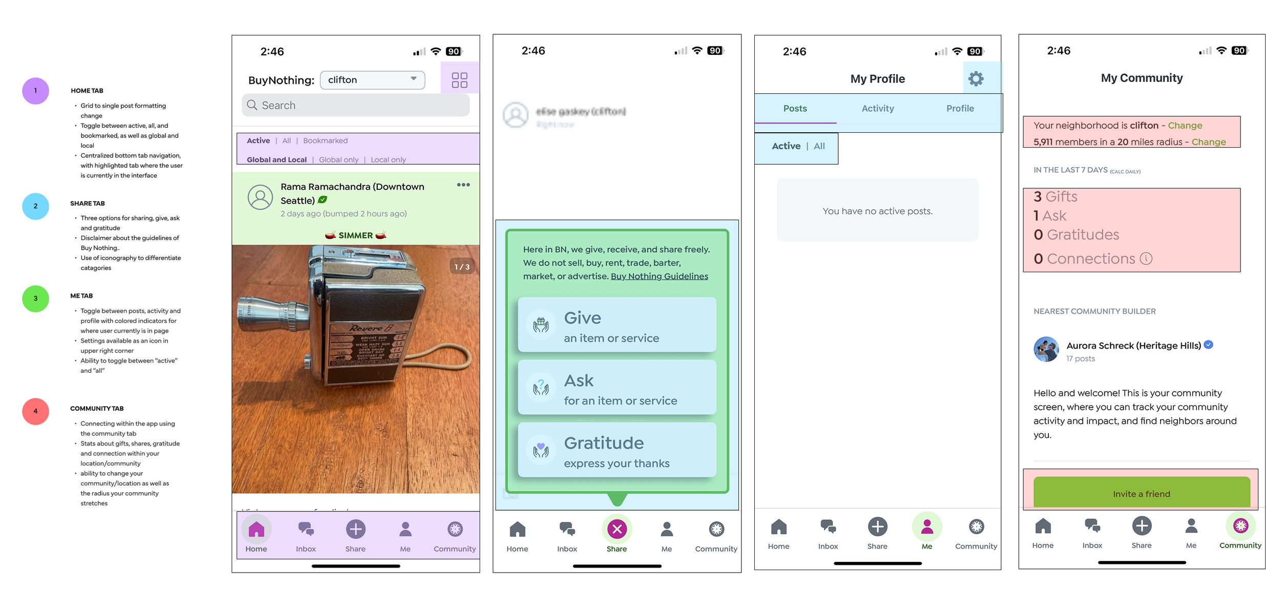
BuyNothing
Personas & Task Flows
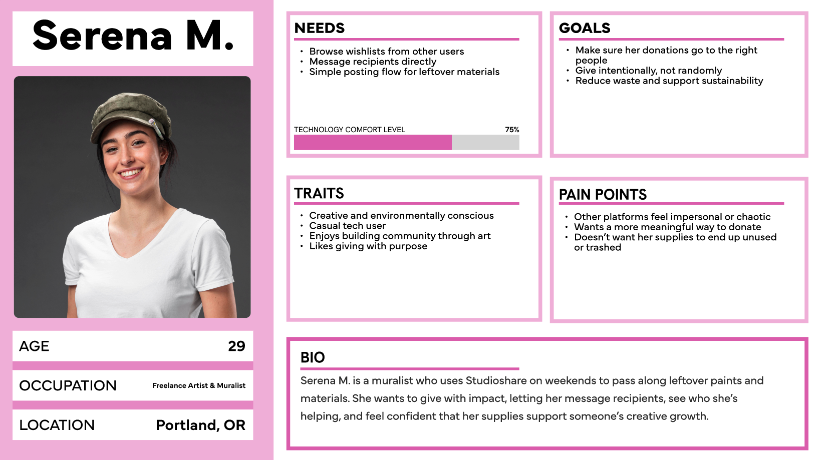
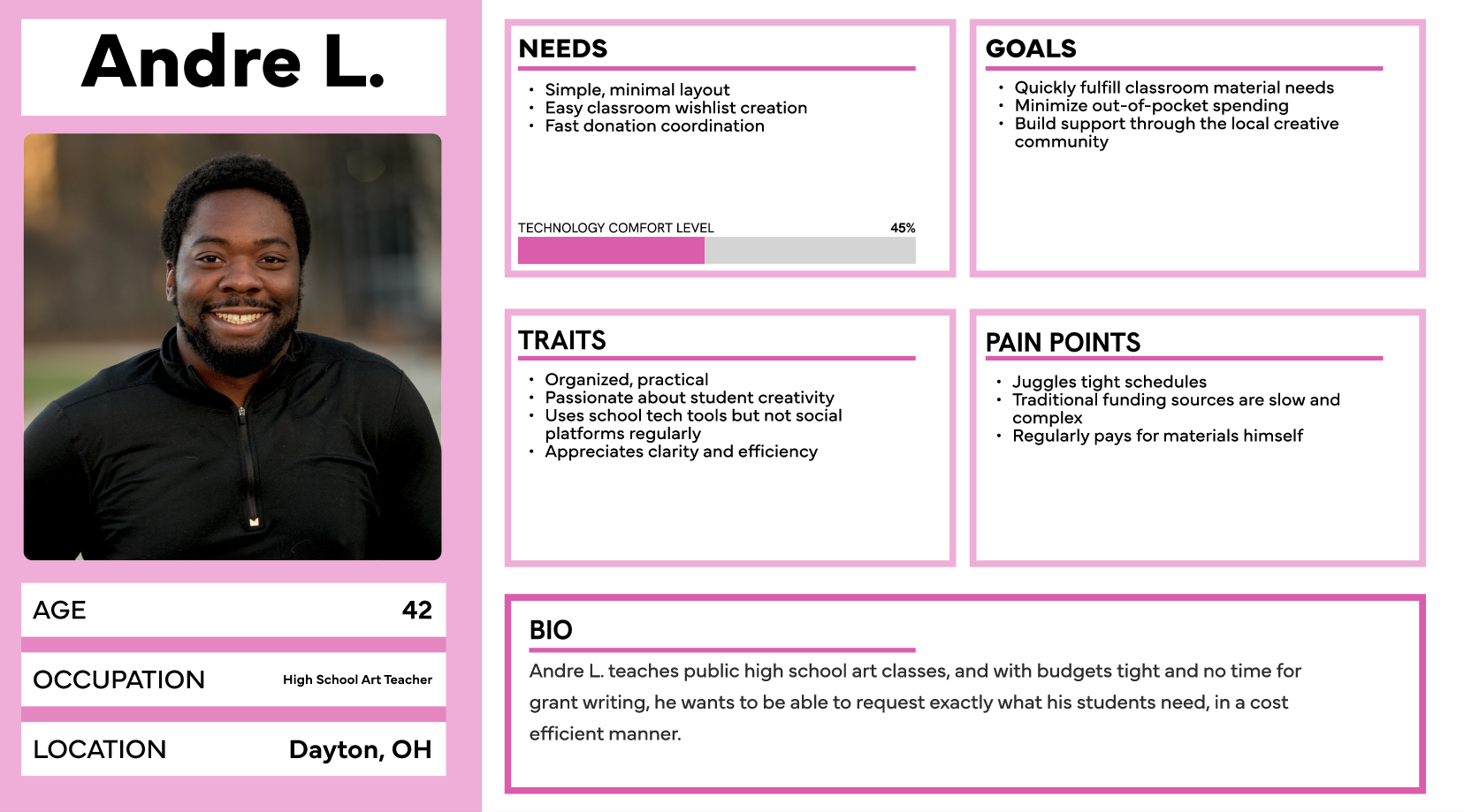
Building out fictional personas based on the target audience allows the user experience to be tailored to each demographic’s needs.
It’s easy to assume that freelance artists like Serena can simply use Craigslist, Facebook, or community centers to donate unused materials. But those platforms often feel transactional, disorganized, or impersonal, and don’t ensure donations go to those who truly need them.
It’s commonly assumed that teachers like Andre can rely on school grants for classroom supplies. Based on my research, however, these resources often involve slow funding cycles, proposal writing, or competitive access, misaligned with the fast-paced, under-resourced nature of public education, ultimately resulting in teachers paying out of pocket.
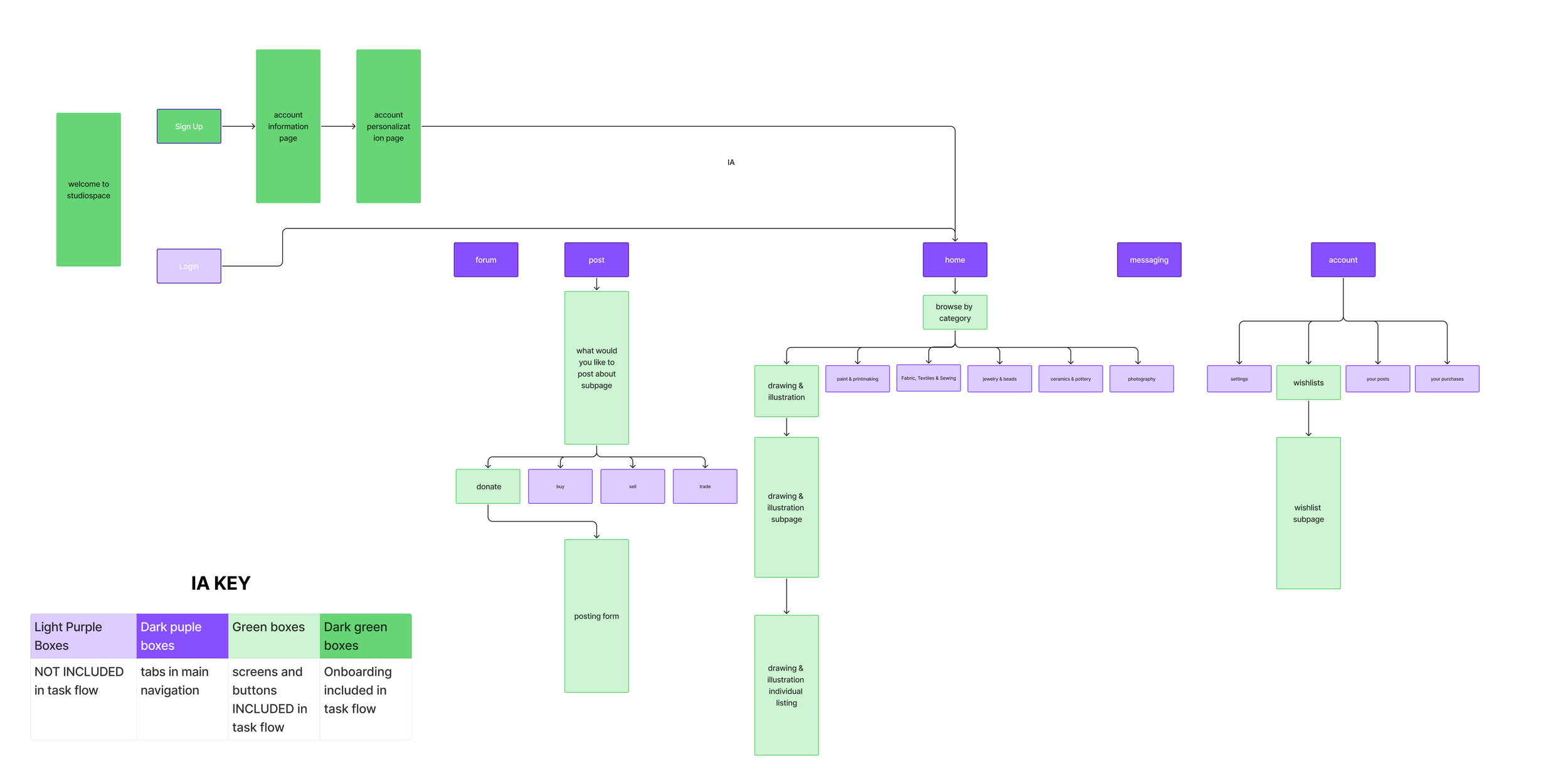
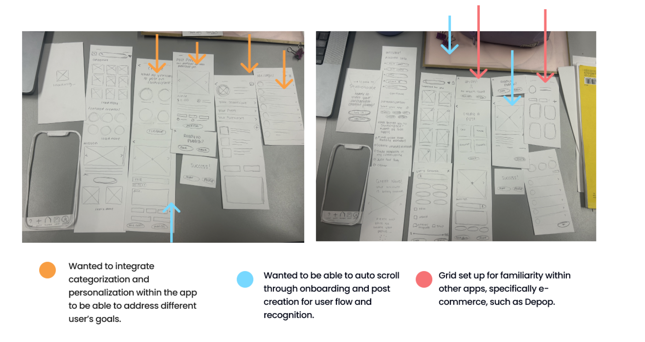
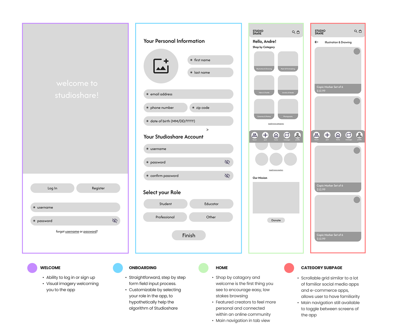
Tab view was supported by my peers. Was the most effective way of navigating through my app, and was very straightforward and recognizable
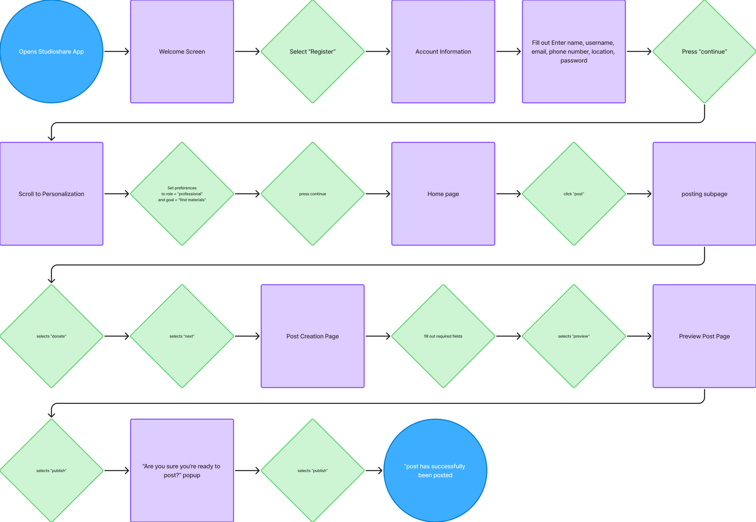
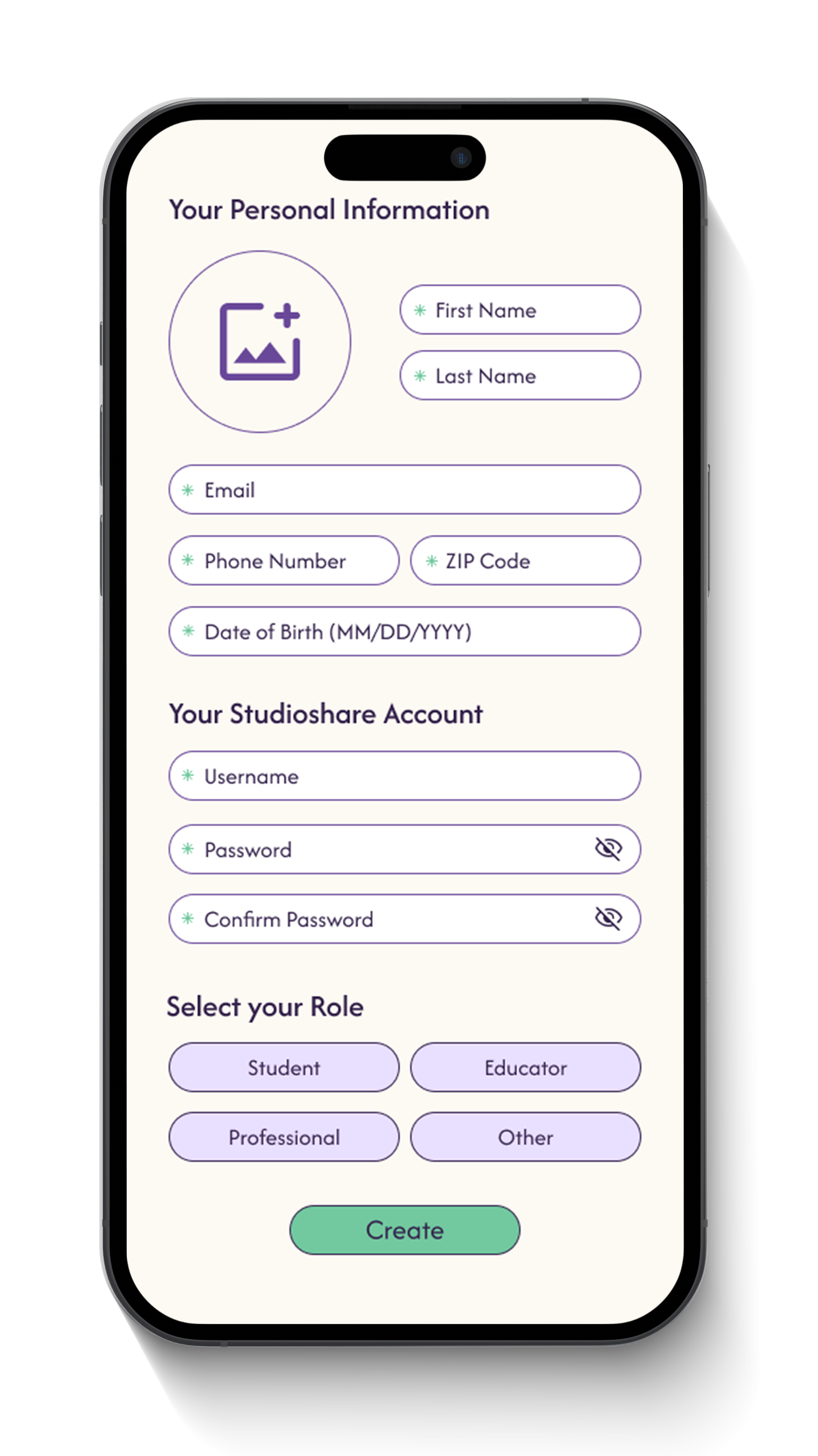
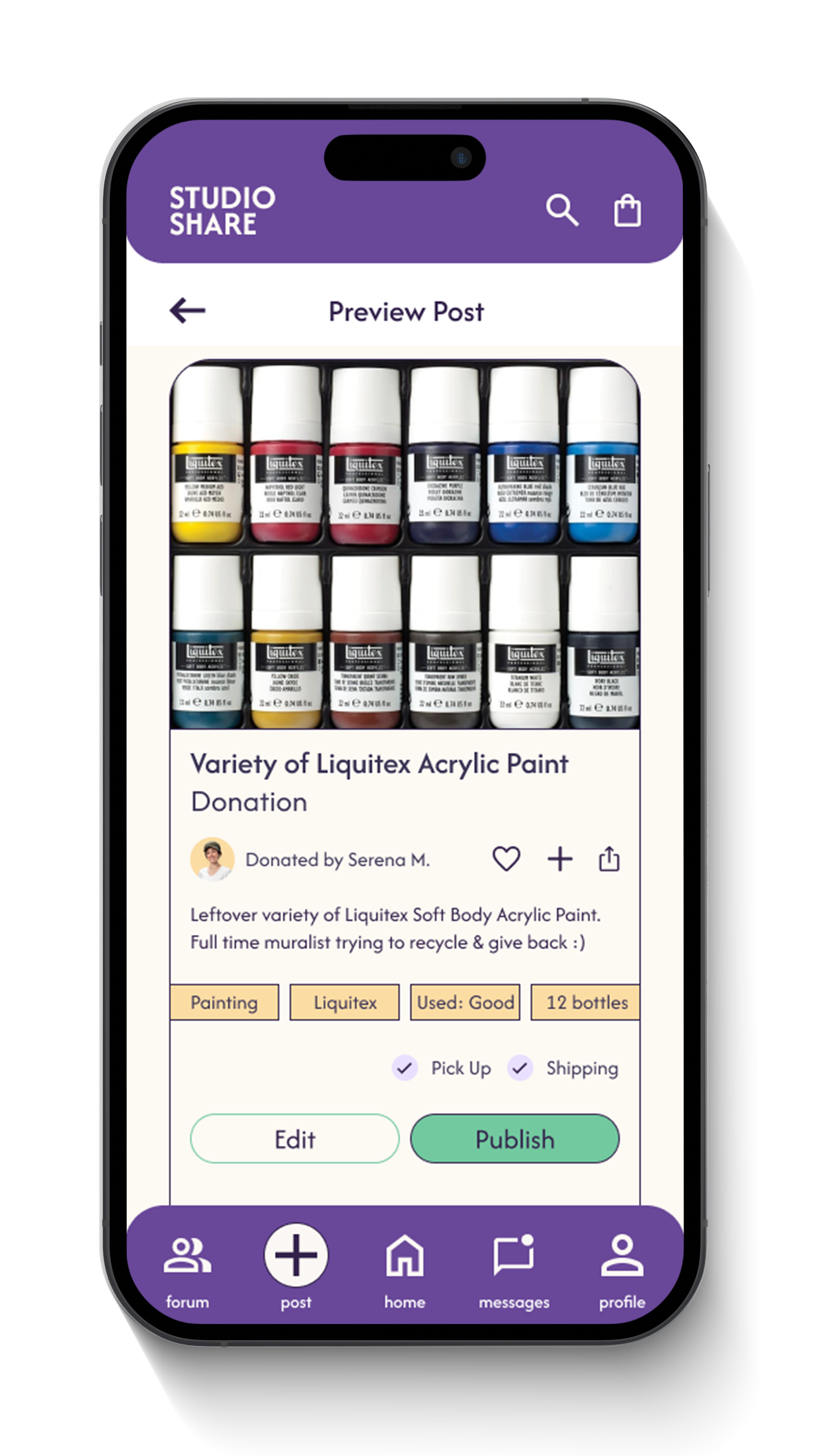
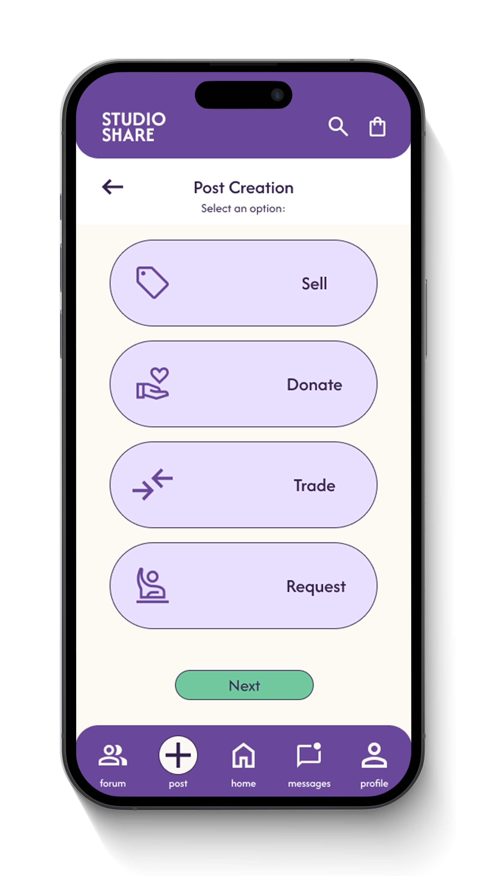
This task flow shows how Serena, a muralist and freelance artist, donates unused supplies through the app. The flow is designed to be quick, mobile-friendly, and low-pressure. Steps like item tagging, previewing, and post confirmation help her complete the task confidently and anonymously. The layout prioritizes clarity and speed, supporting short, focused interactions during off-hours.
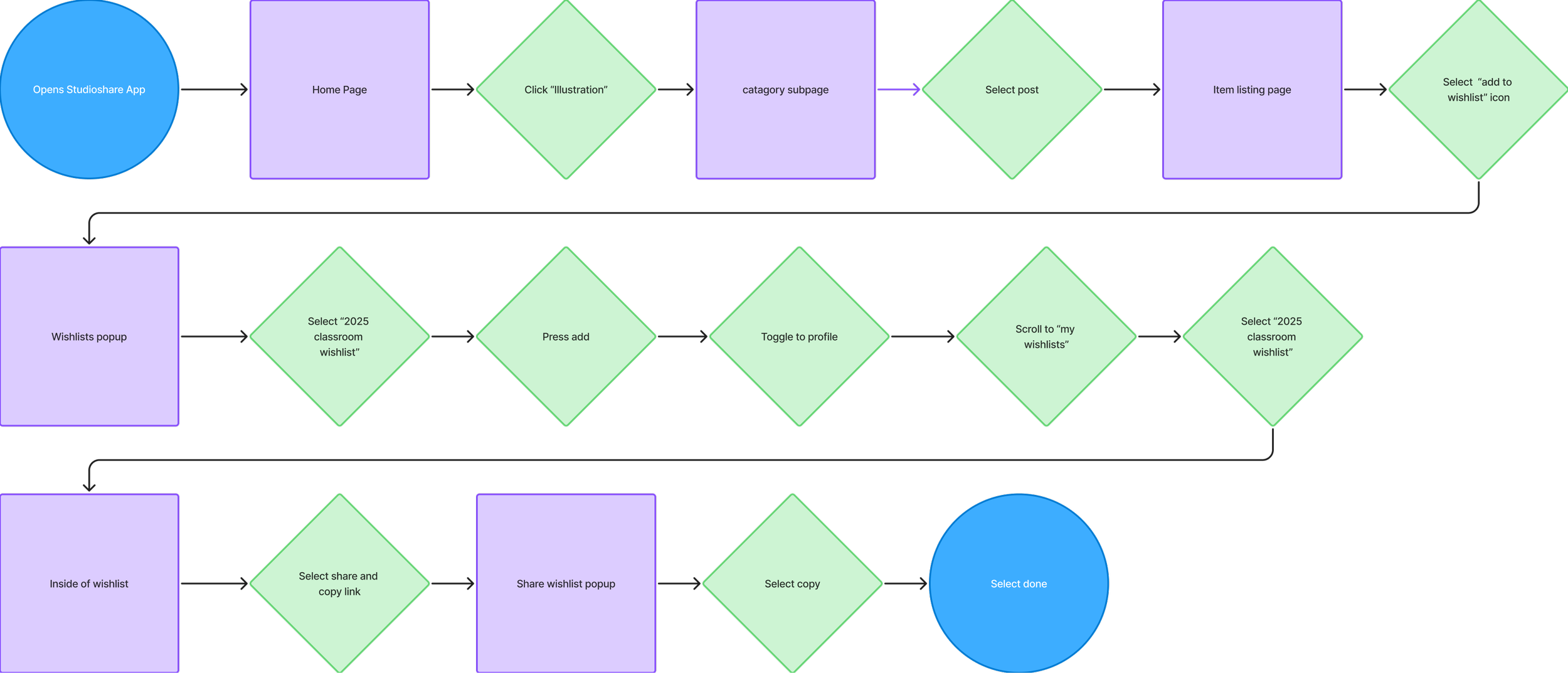
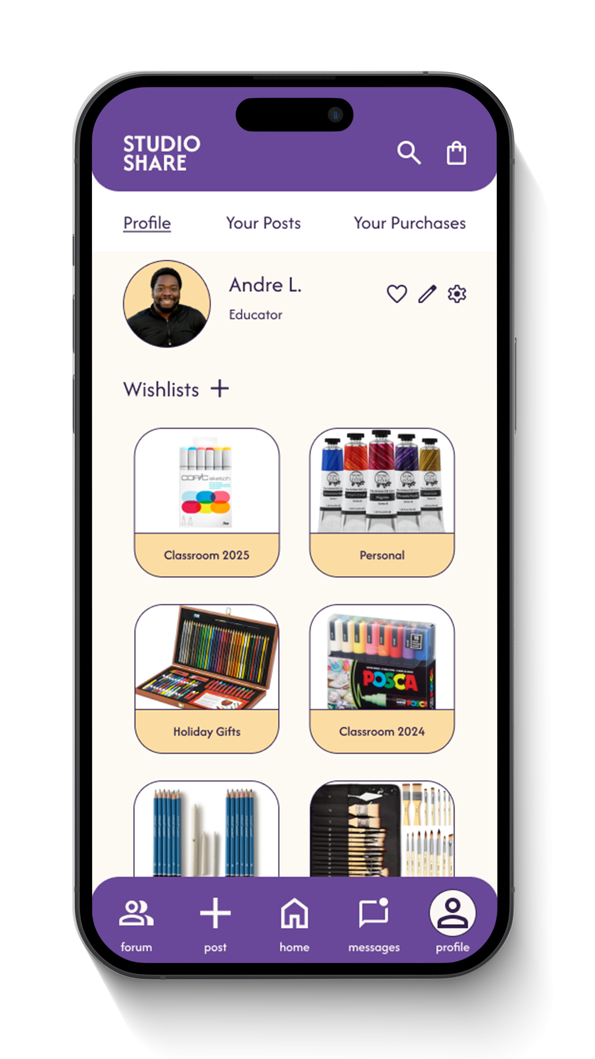
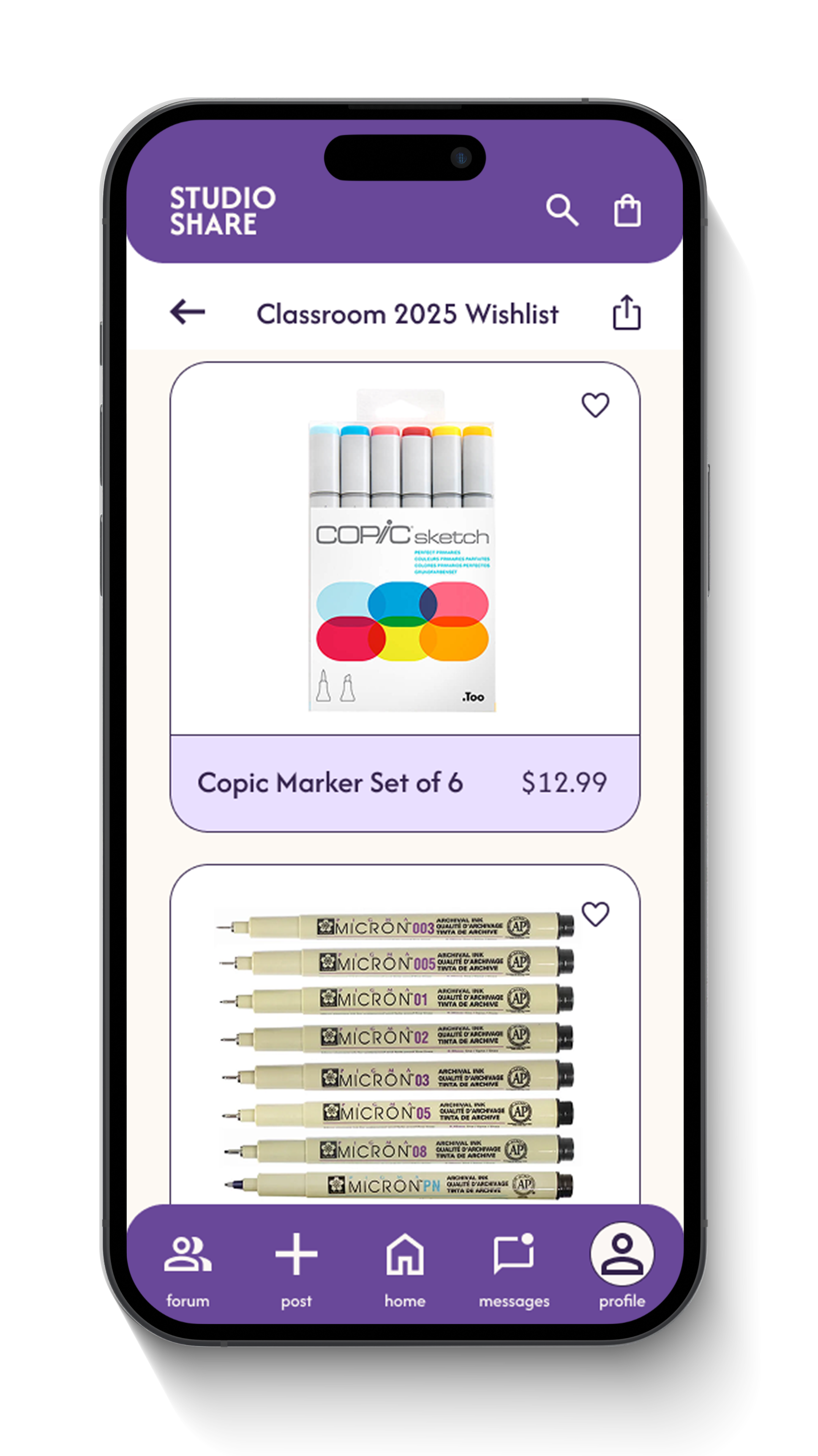
This flow maps how Andre, a high school art teacher, adds items to his classroom wishlist and shares it with potential donors. Designed for use between classes, the process is streamlined and uses simple, direct labels. All actions, from selecting a wishlist to copying the share link, are kept within a couple taps, making it easy for time-strapped users to get support without hassle or tech frustration.
Information Architecture
The information architecture highlights a tabbed method, where each tab of the app serves a specific purpose. The user can easily click between tabs for different goals they may have while using Studioshare, including posting, browsing, making wishlists, and more.
Wireframing
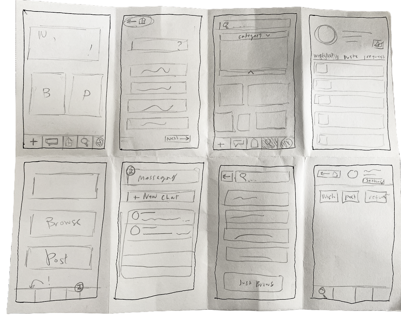
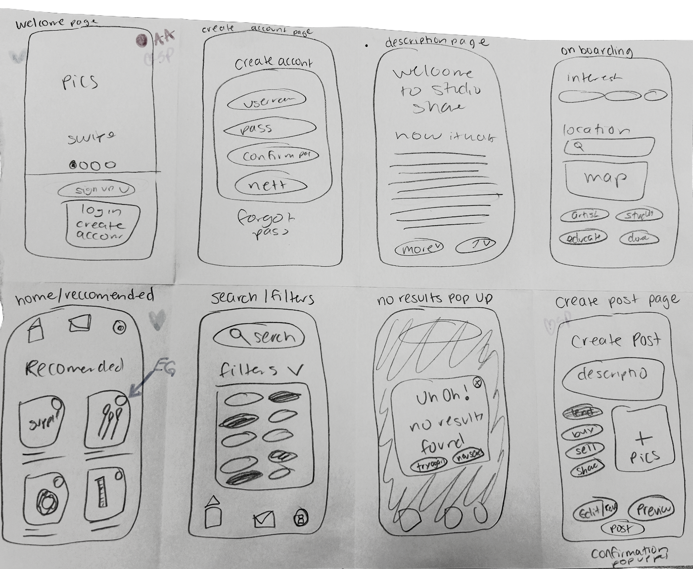
Sketches (with peer feedback)
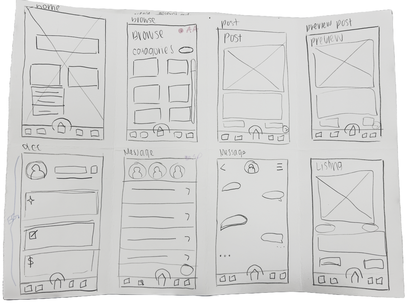
The use of imagery and iconography was very successful, due to the app being very visual oriented.
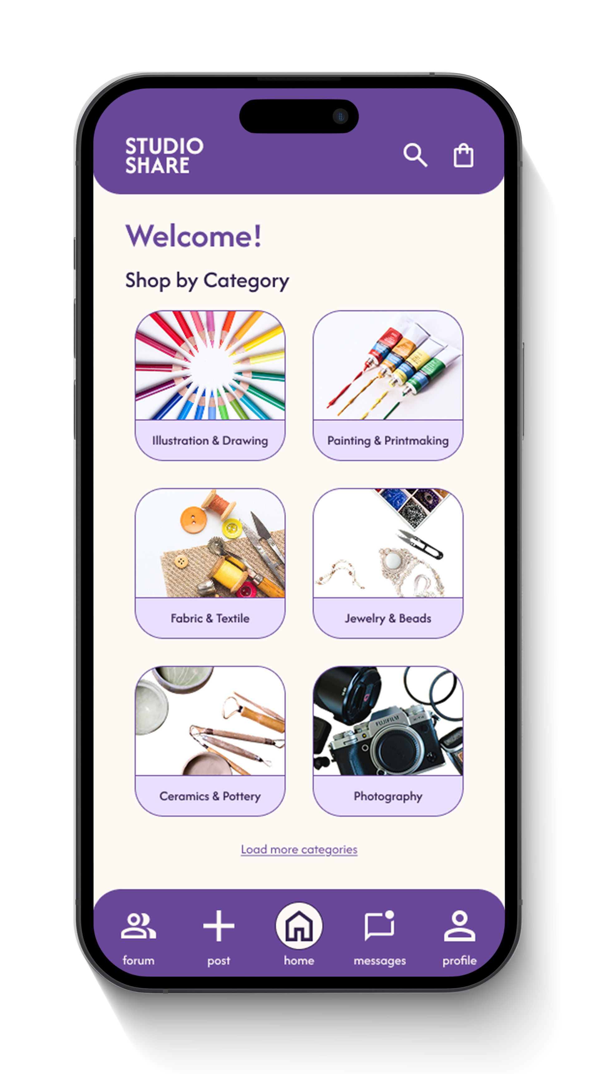
Browsing by category ended up being the most logical way of sorting goods within Studioshare, due to some users not knowing exactly what they may be looking for.
Paper Prototypes
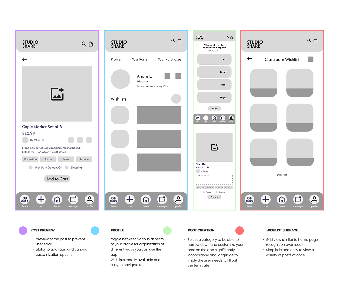
Lo-Fi Wireframes
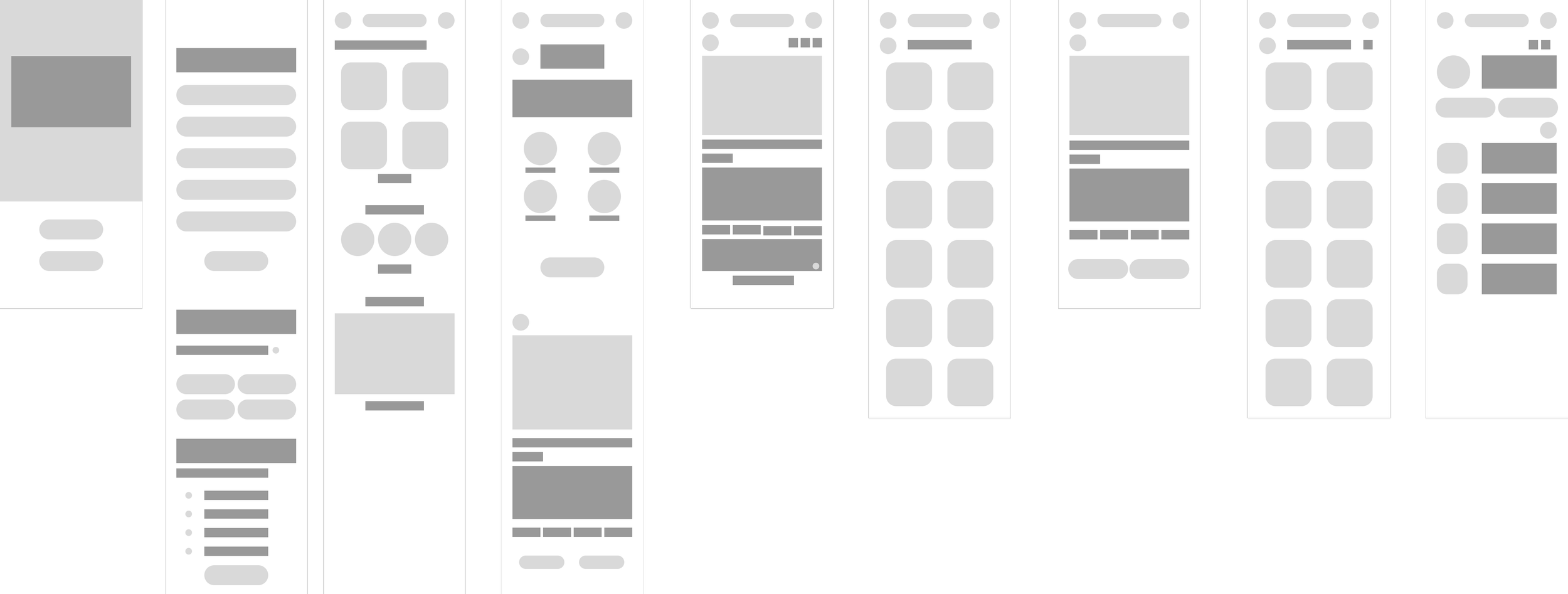
Low-Fi wireframing is where solidifying my task flows began. I knew I wanted rounded shapes, lots of imagery, and identifying clues to help the user navigate the app.
Mid-Fi Wireframes
Mid-Fi Wireframes
Visual Design
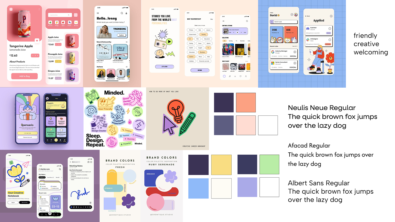
Moodboard
This moodboard supports the Studioshare concept by emphasizing approachability, warmth, and clarity, all of which align with the app’s goal of making supply exchange feel safe and inclusive. The rounded UI elements, friendly color palettes, and clean layouts reflect a non-intimidating, community-first tone.
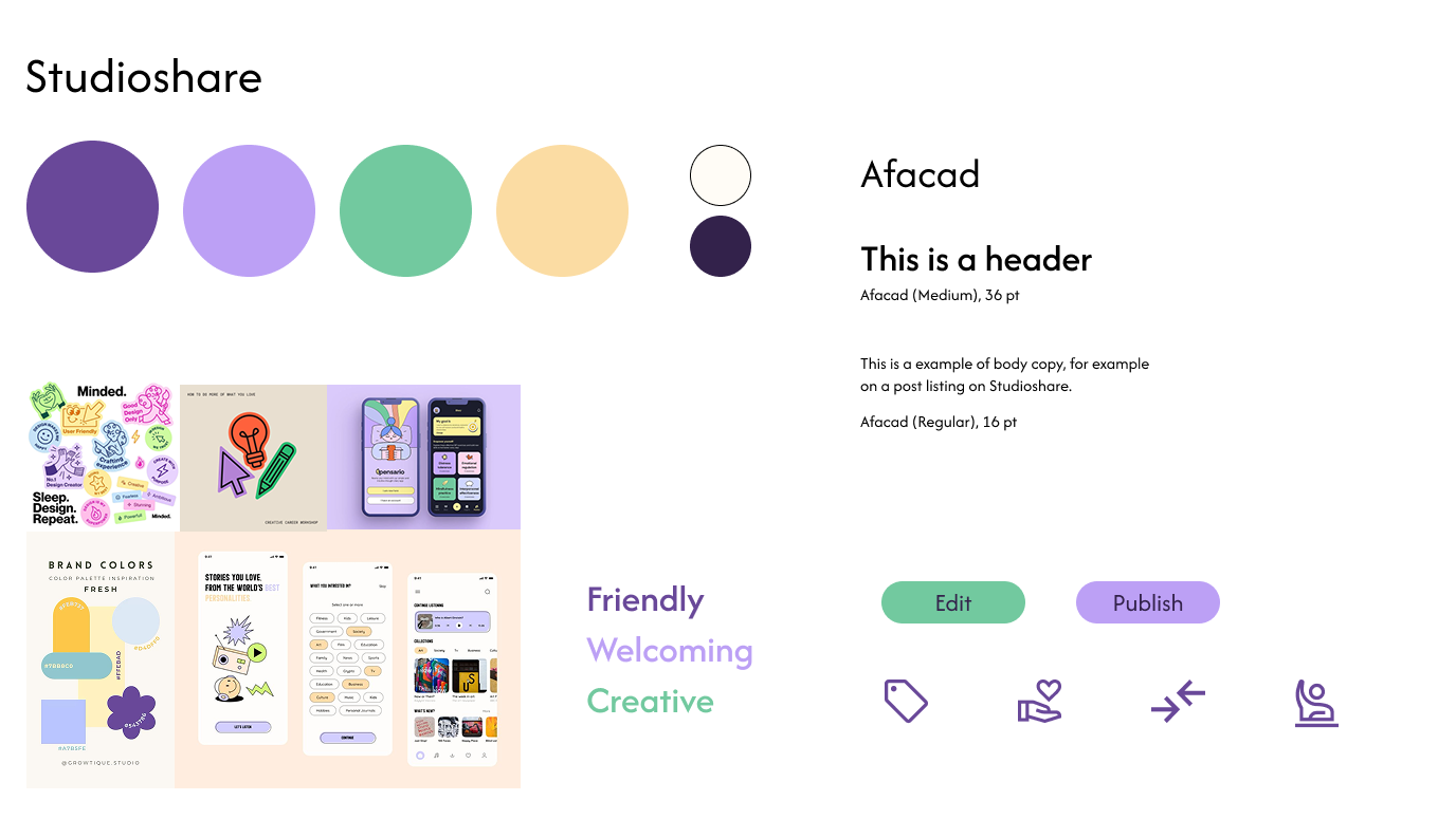
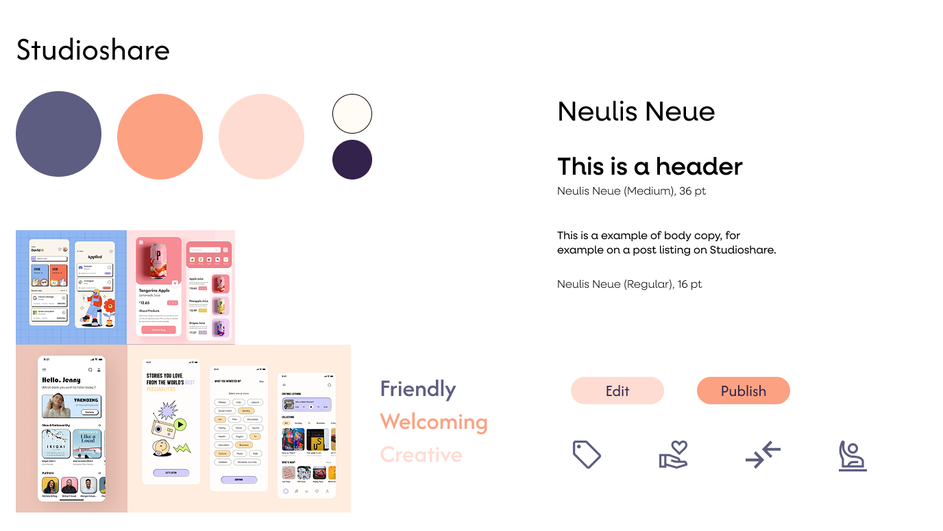
Style Tiles
Style Tile Application
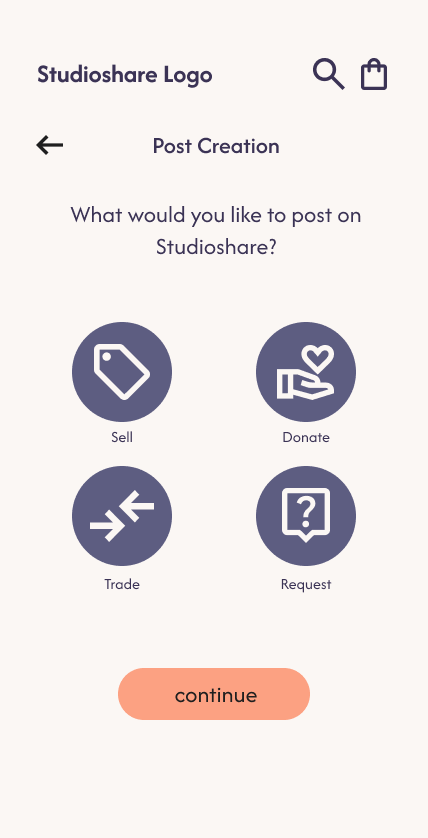
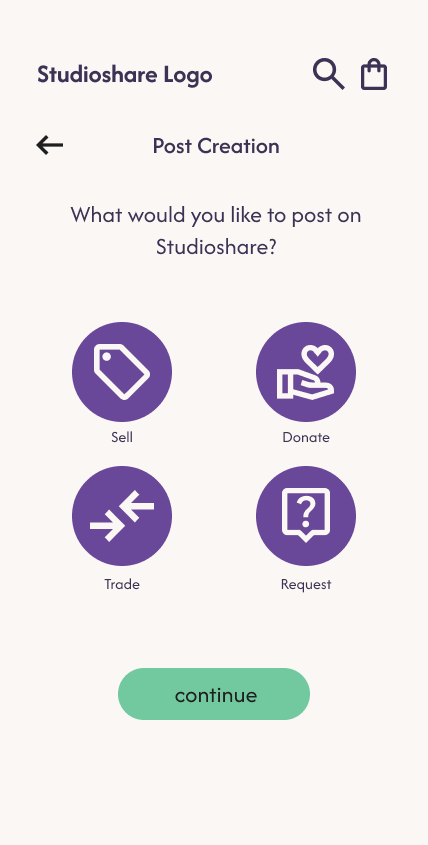
The right color palette better reflects Studioshare’s mission of fostering creative equity and community trust. Its soft purples, calming greens, and friendly yellow convey emotional safety, accessibility, and warmth, essential qualities for users navigating material insecurity or seeking intentional giving. The left palette, while visually striking, feels more bold and commercial, which could compromise the emotional sensitivity needed for Studioshare’s user base.
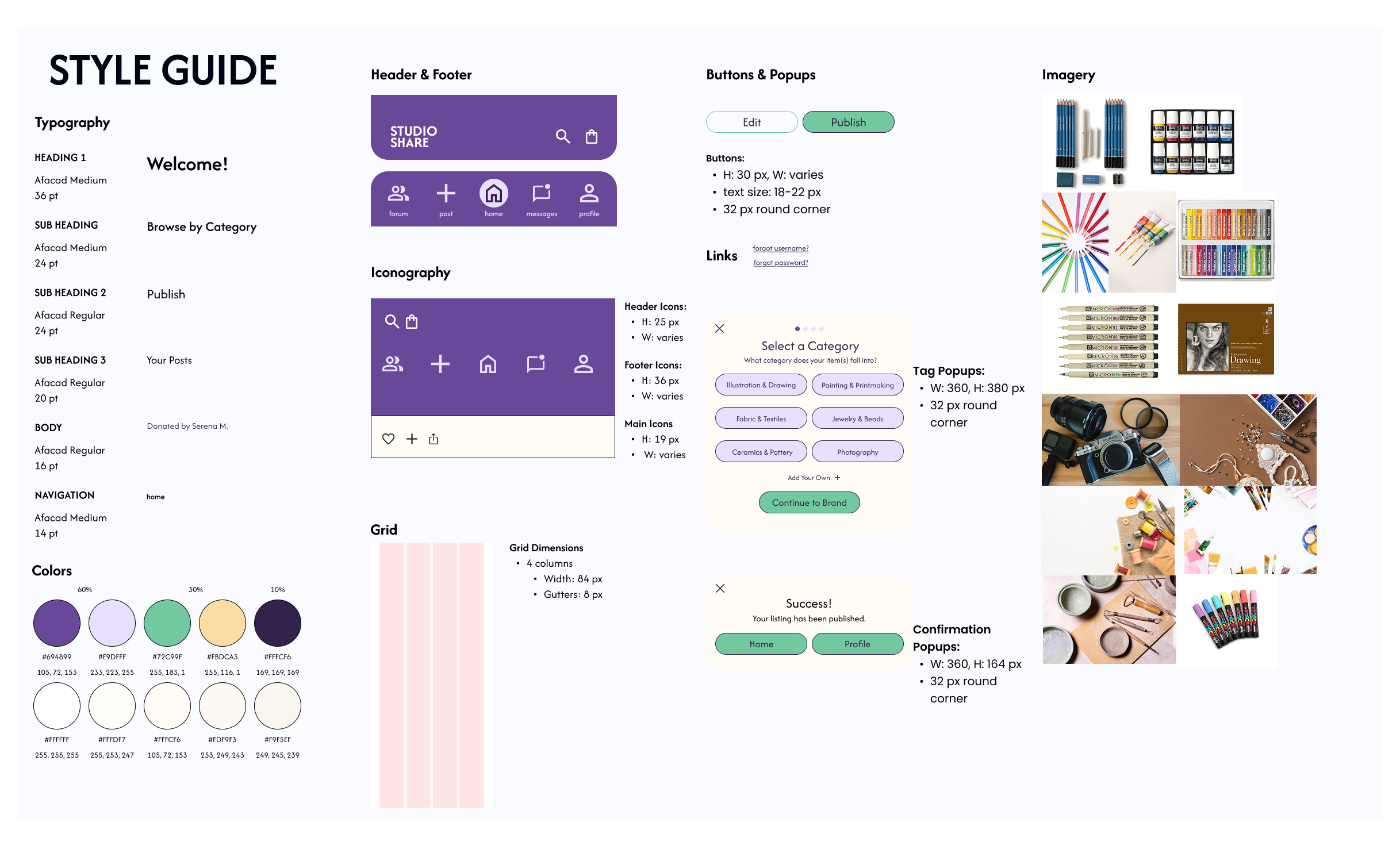
Final Style Guide
Final Style Guide
Final Style Guide
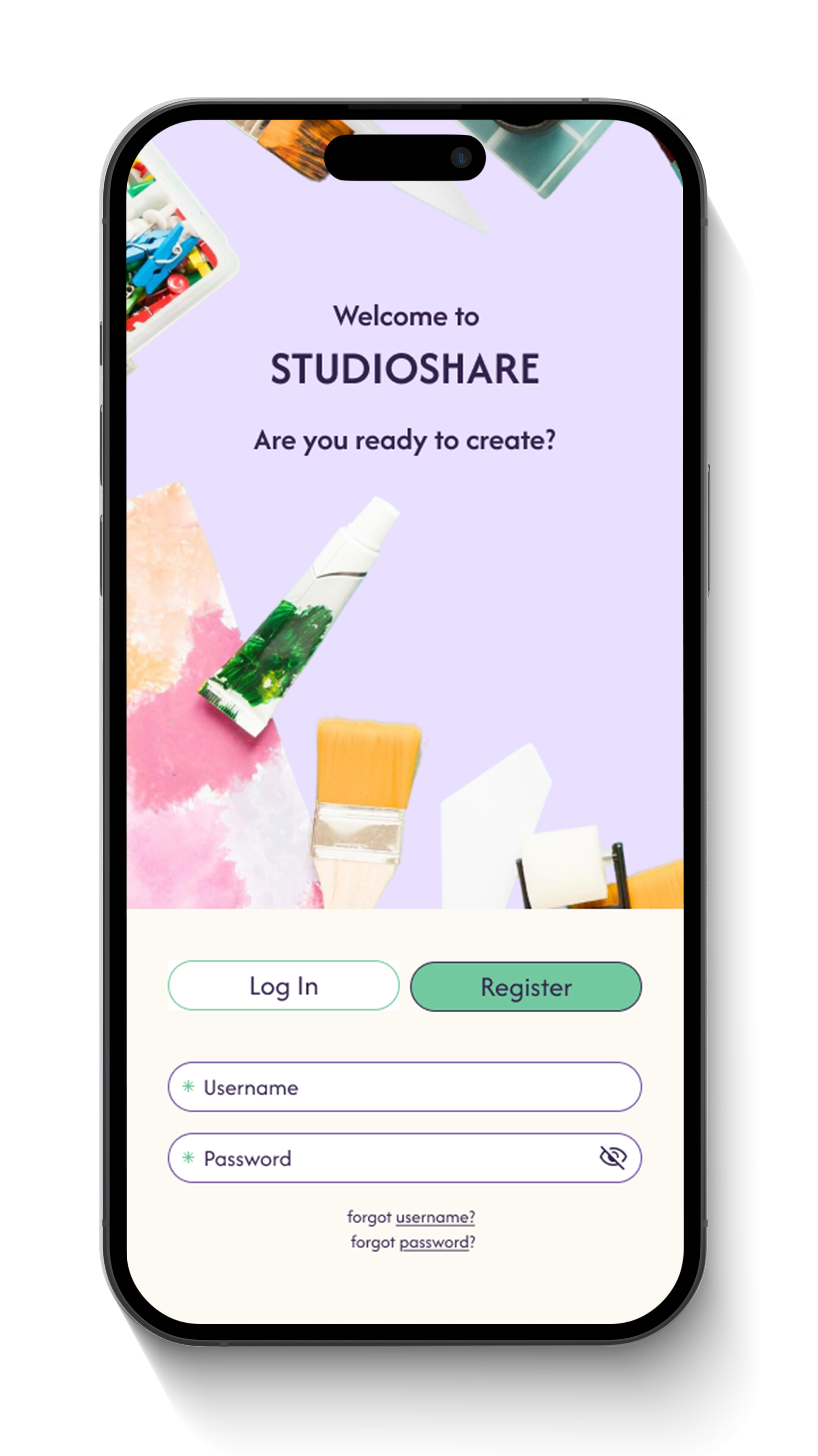
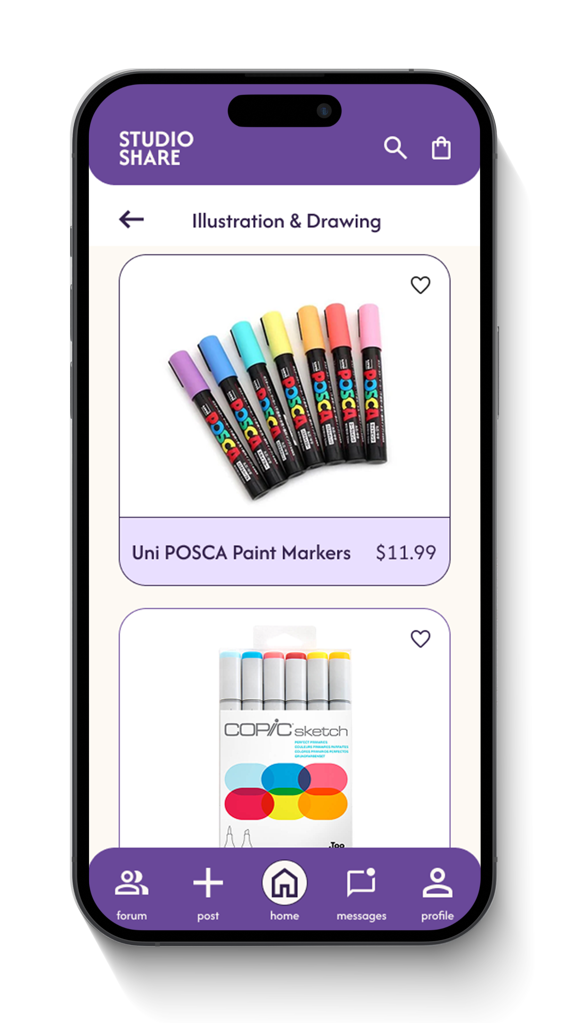
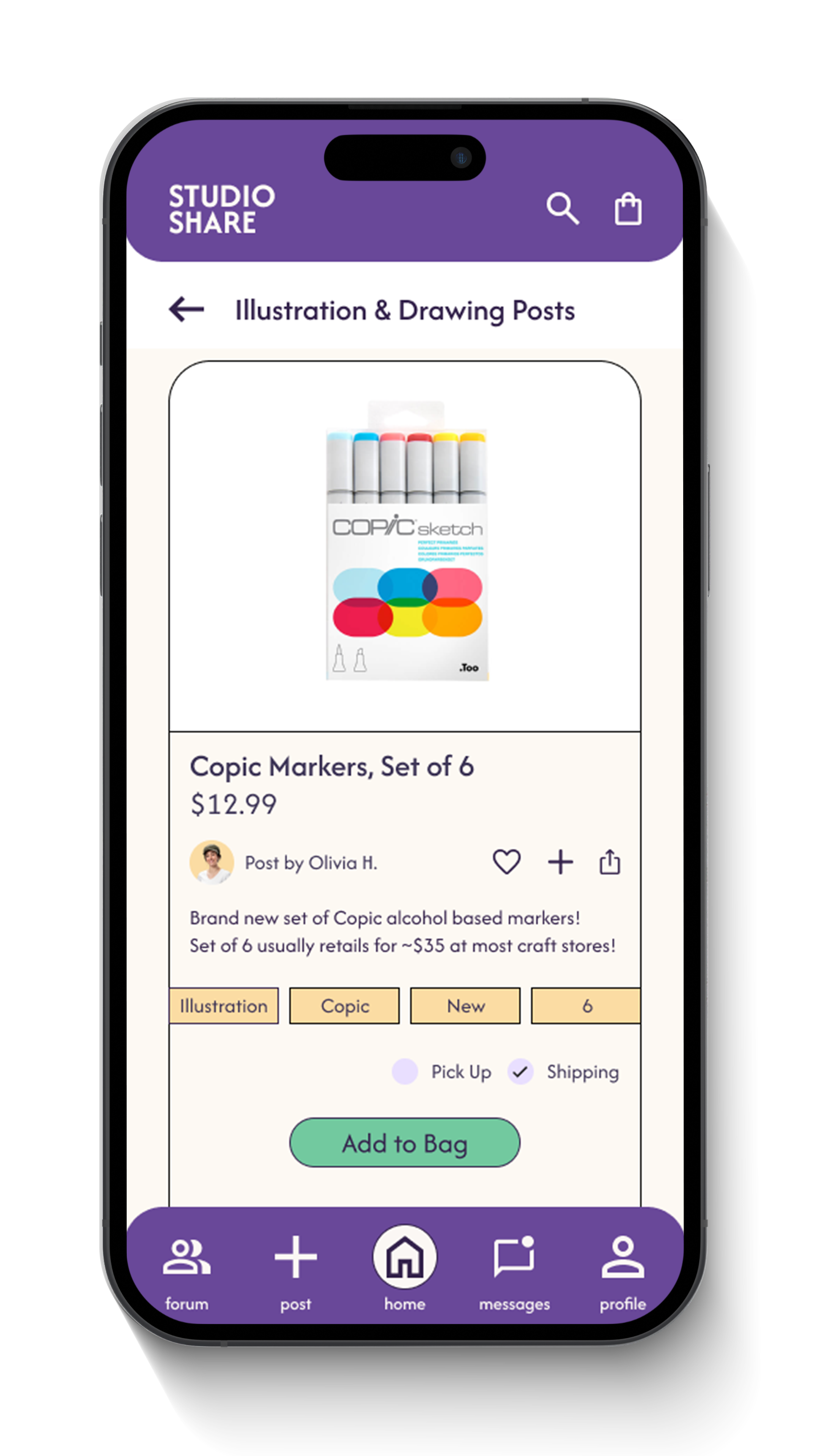
Final Screens


