Gaia Restaurant
Brand Development | Graphic Design
Graphic Design studio project focused on developing a fictional restaurant identity with its own custom wordmark, menu, and touchpoints reflecting the brand’s core values and mission.
Conceptualizing
Empowerment through Nourishment
Empowerment through Nourishment
Cycle Conscious Living & Education
Welcoming & Inclusive
Why?
Gaia is a fictional, female-owned and operated cycle-conscious café designed to nourish and empower women through every phase of their lives. Rooted in the belief that food is a form of self-respect and wellness, Gaia offers thoughtfully crafted dishes that support hormonal balance, emotional well-being, and joyful eating, without sacrificing flavor or comfort. Various types of foods are known to help women with menstrual, postpartum, pregnancy, menopause, and overall female health.
Brand Values
Cycle Conscious Living & Education
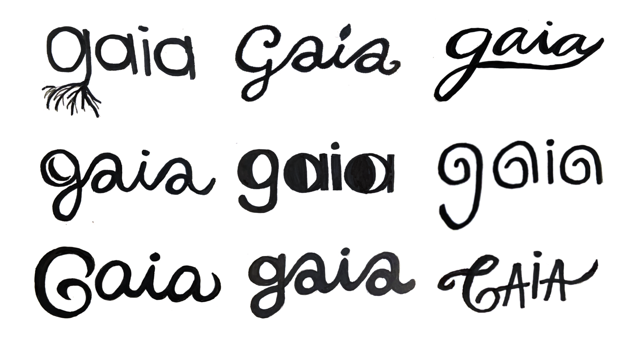
Sketches
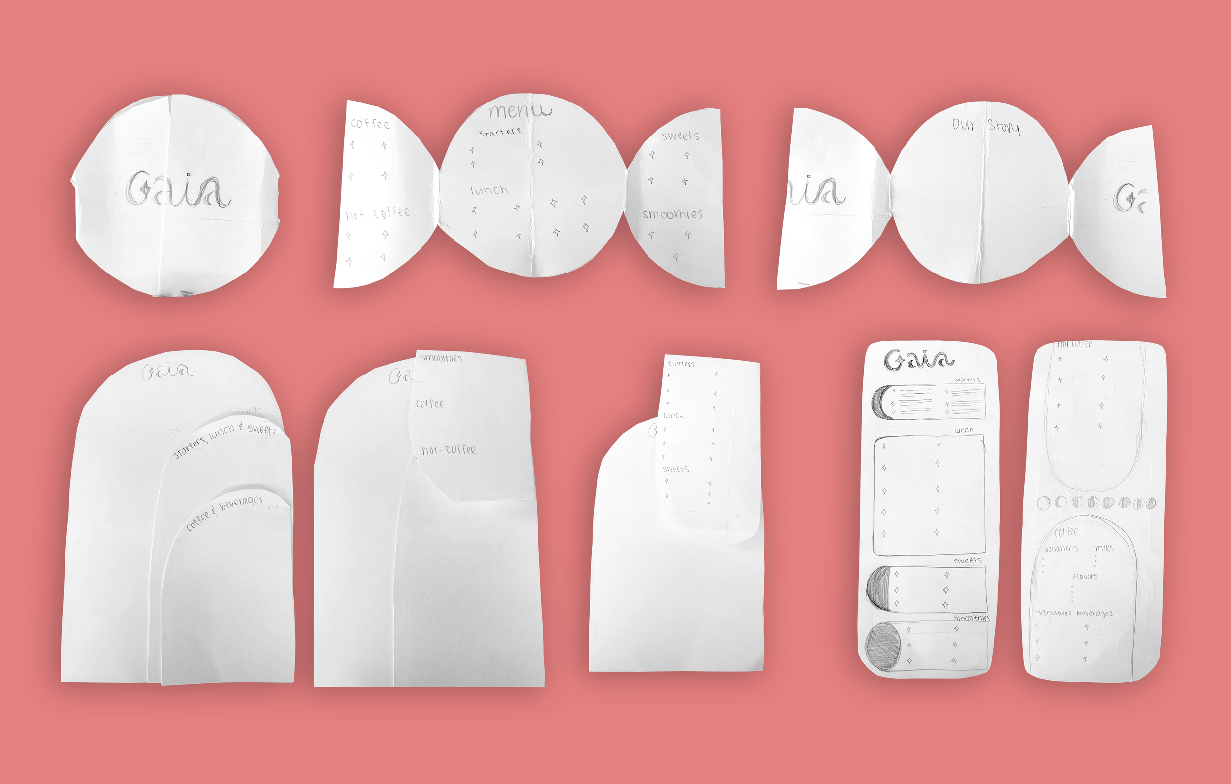
Menu Sketching & Conceptualizing
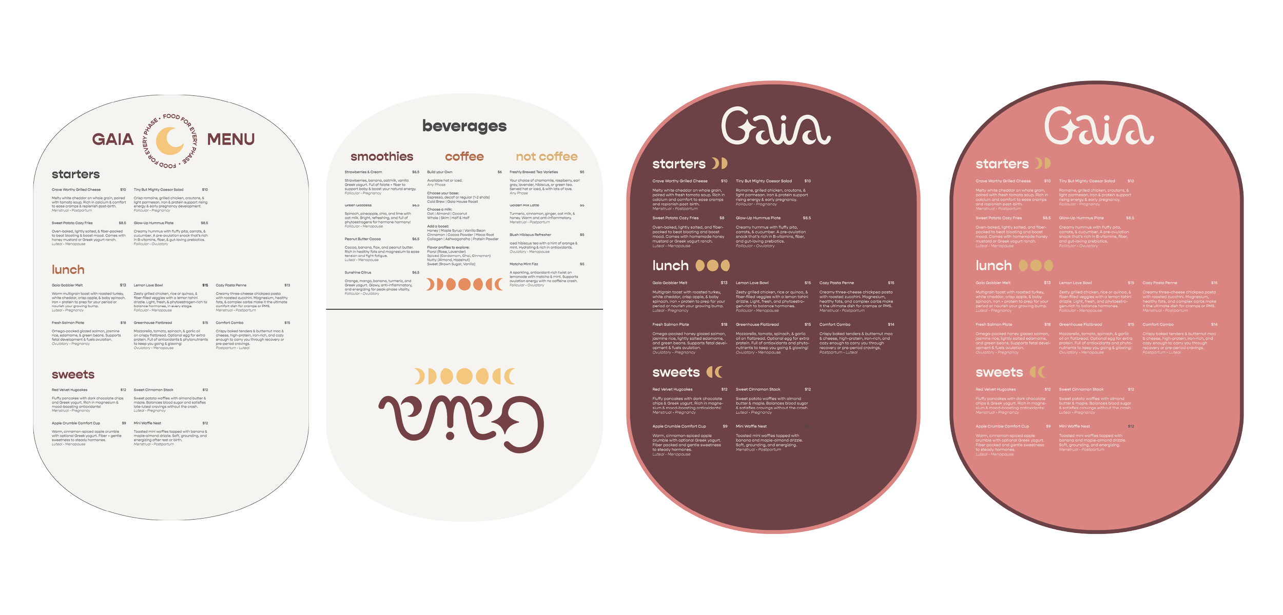
Menu Typographic & Color Variations
Welcoming & Inclusive
Wordmark Creation
The sketch process began by focusing on developing visual concepts that directly correlated to the brand’s values.
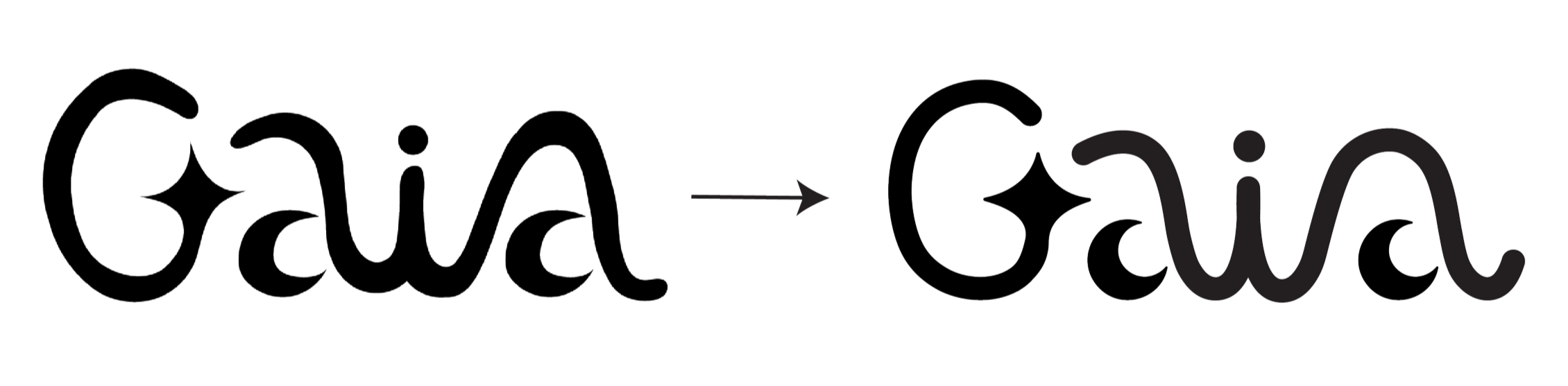
Finalized Sketch to Digitalized Wordmark
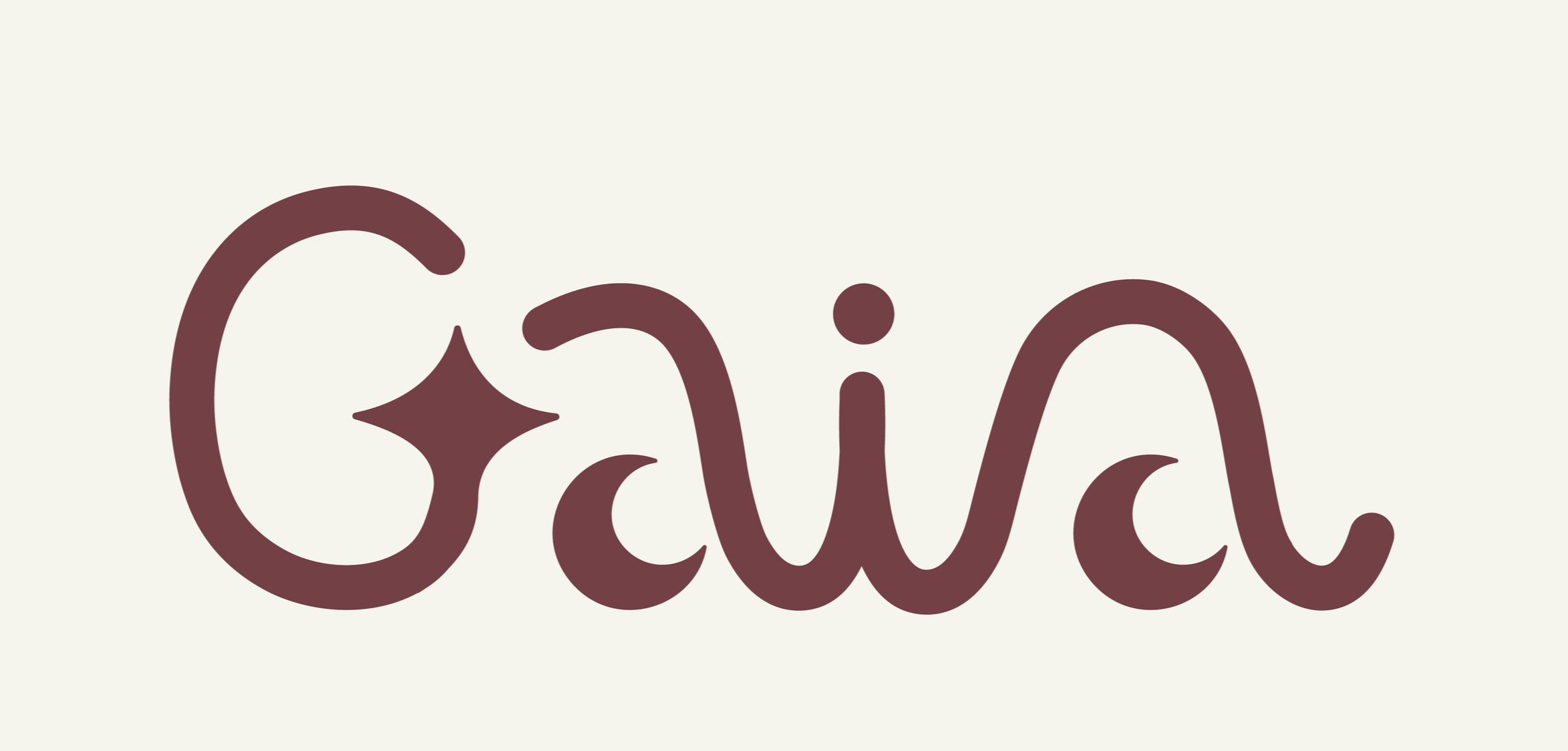
Color Application of Wordmark
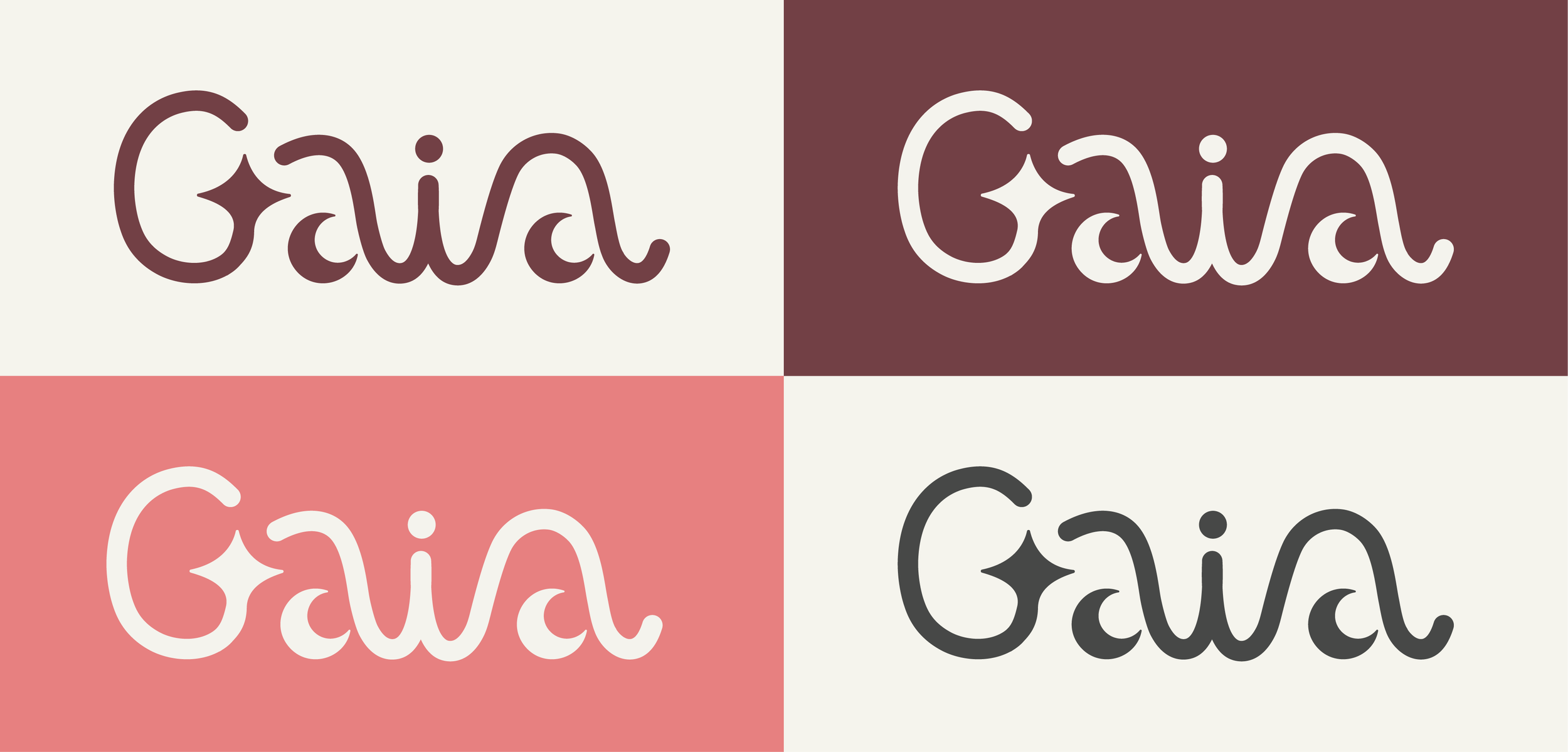
Color Application of Wordmark
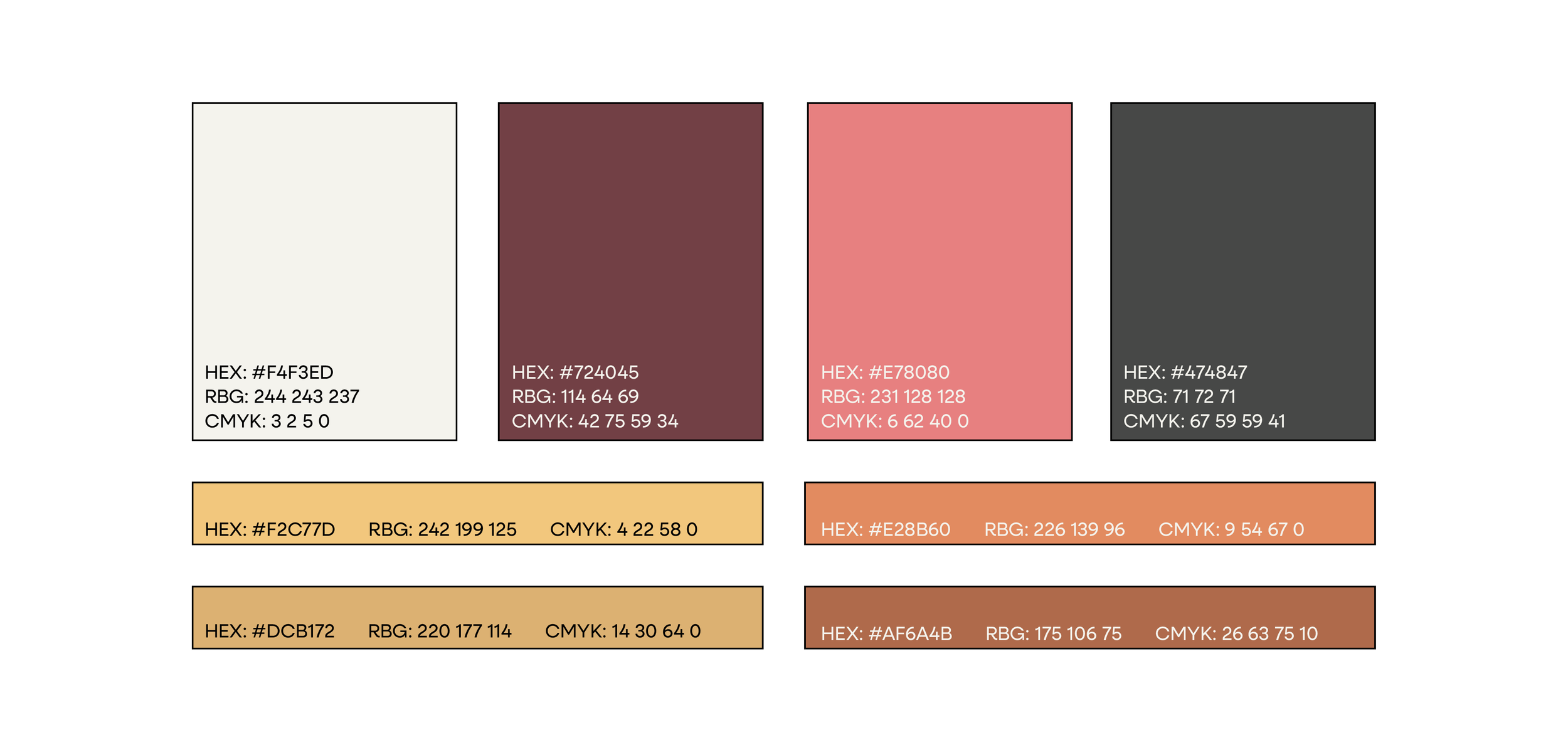
Color Palette
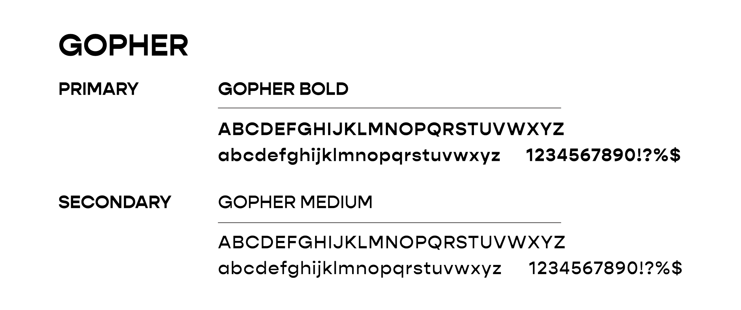
Typography
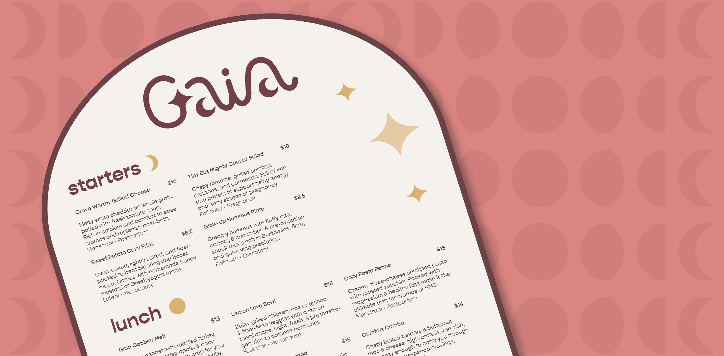
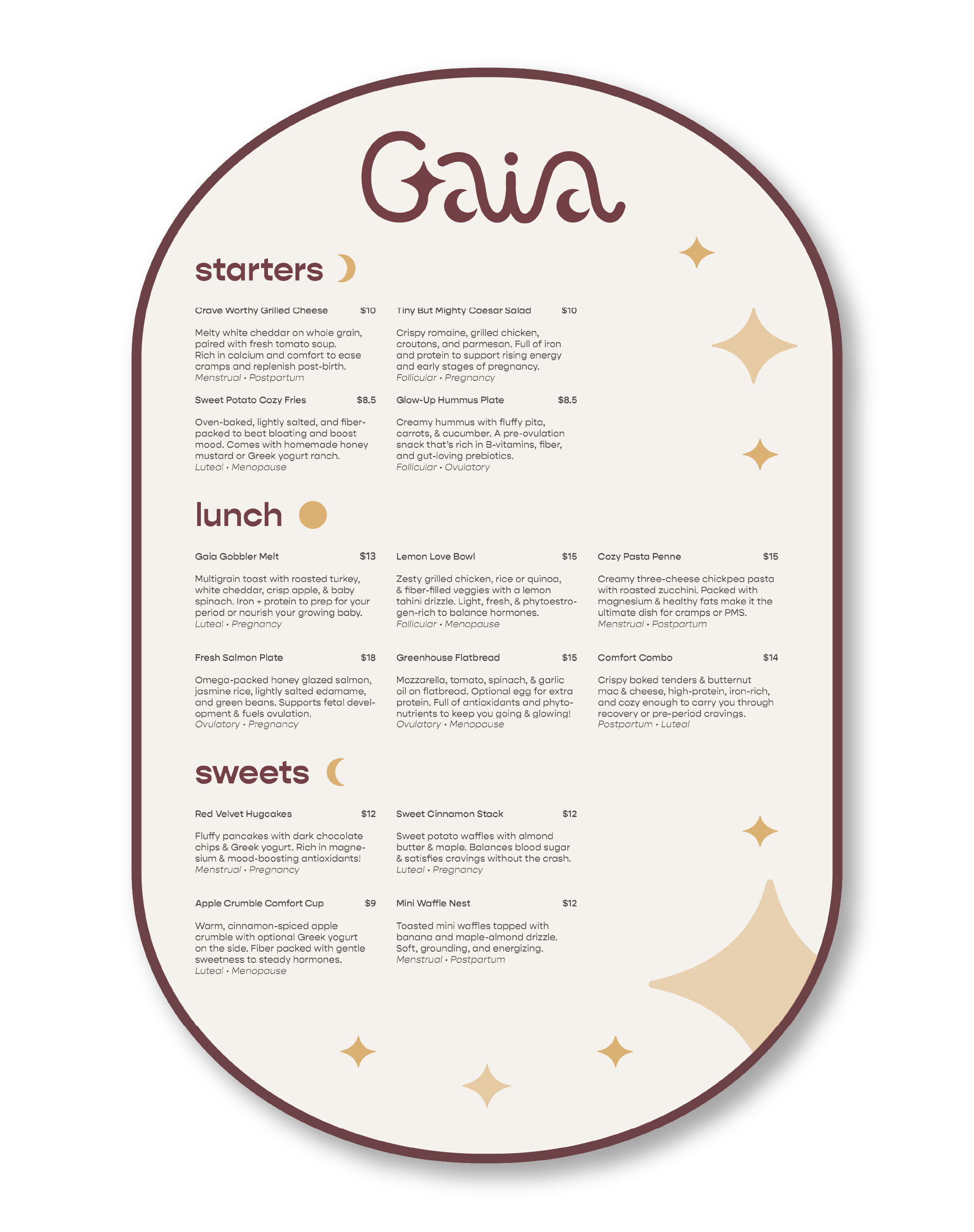
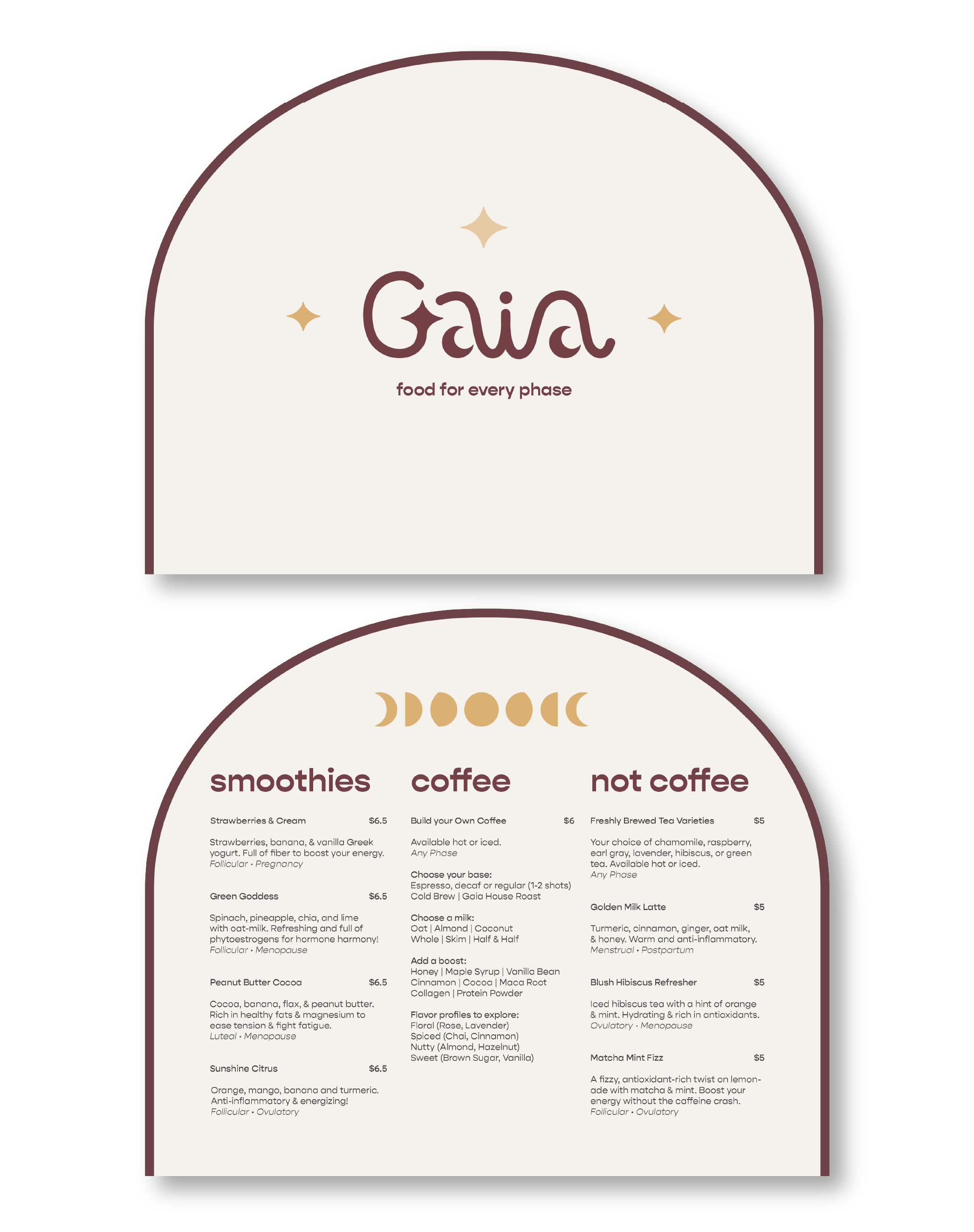
Gaia Menu
The Gaia menu is designed to be reminiscent of a common brand symbol, the moon, due to the comparison of the menstrual cycle to the cycles of the moon. The curved edges and the ability to fold the menu in half encapsulate this concept.
Touchpoints
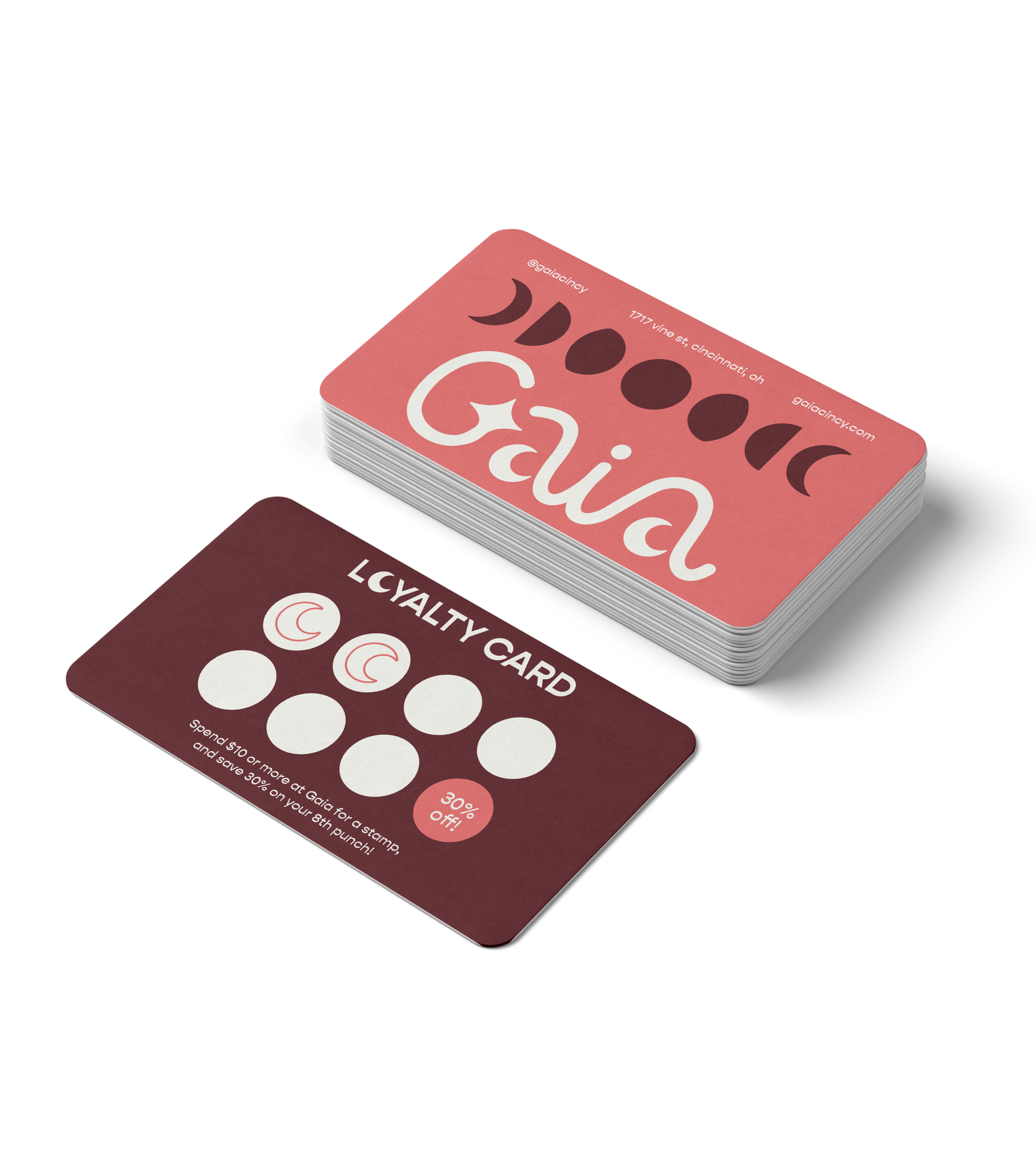
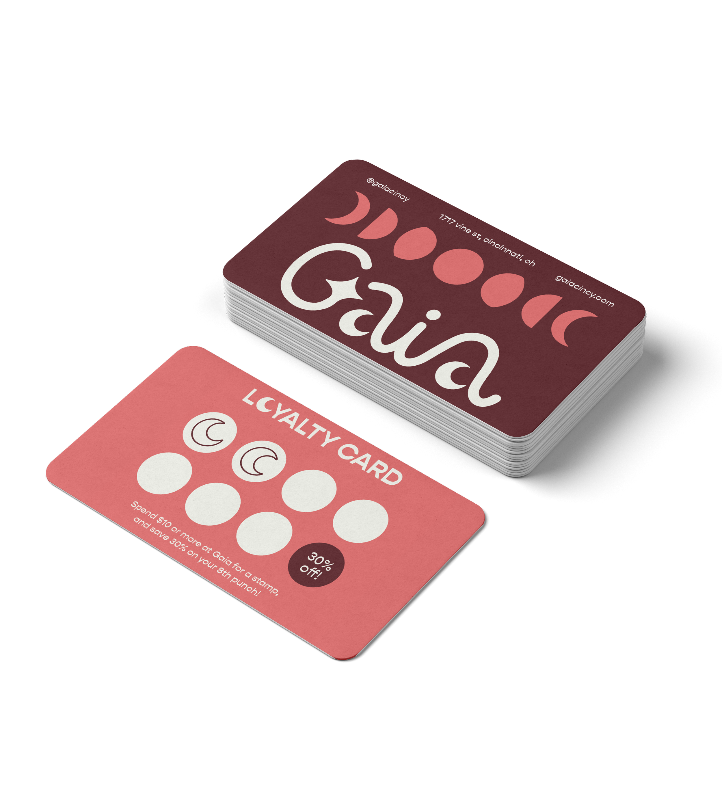
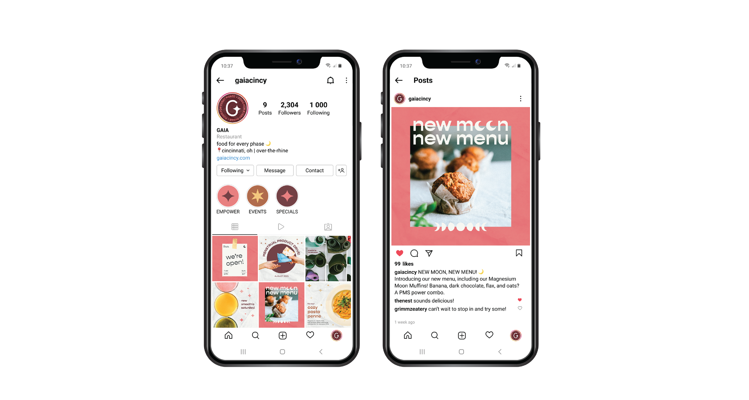
2 additional touchpoints vital to the Gaia brand include an Instagram profile and a loyalty punch card. It was vital that the additional touchpoints reinforce Gaia’s core values as well as promote their brand in an authentic way.
Instagram Profile
Menu Typographic & Color Variations
Loyalty Punch Card