Sensoria Magazine
Typography | Publication Design | Wordmark Creation
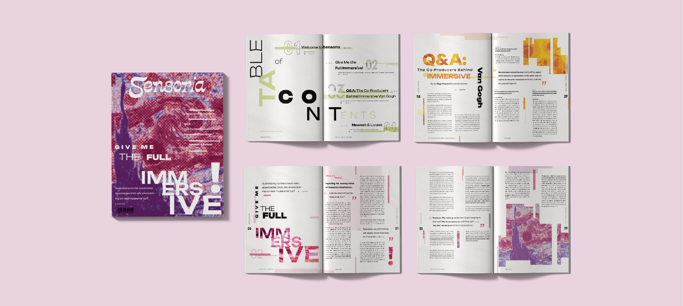
Typography studio project focused on developing a multi-spread publication with its own custom wordmark. Typographic hierarchy and experimentation connect each spread to communicate the purpose of the publication and provide consistency.
Conceptualizing
Sensoria is…
creative immersed dynamic engaging welcoming enlightened
Why?
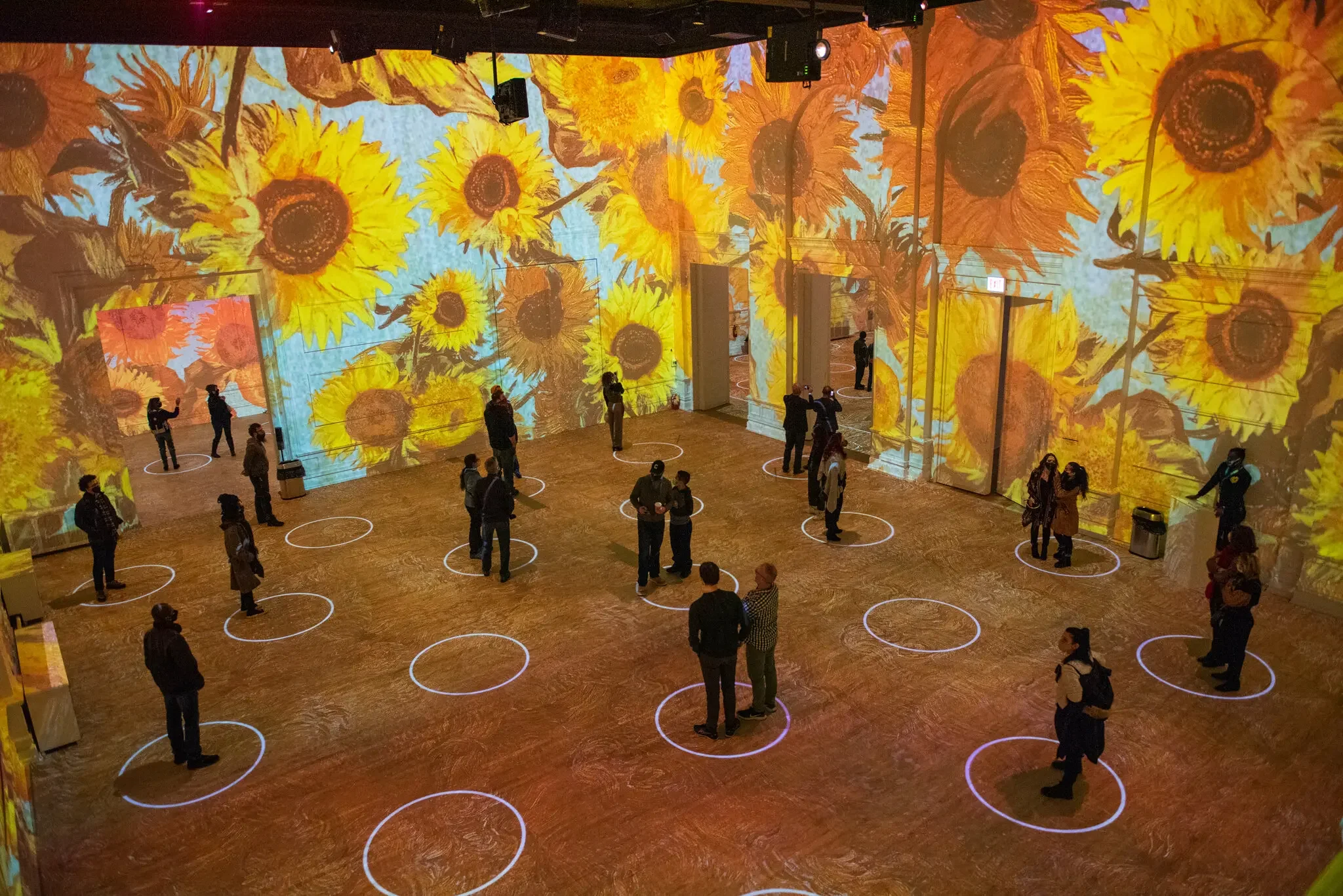
As technology continues to evolve, artists and their mediums are expanding in new, innovative directions. This has brought the rise of immersive and multi-sensory art. Art isn’t just for viewing anymore. It’s about all of the senses. Sensoria aims to capture this shift in the art world by spotlighting artists who use immersive and sensory-driven experiences to push the limits of what is now possible. The publication explores how interactive and multi-sensory work is reshaping creative expression, placing audience participation, emotional impact, and innovation at the center of future artistic trends.
Concept Statement:
Sensoria is an art & culture publication that embraces the world of surreal and interactive art.
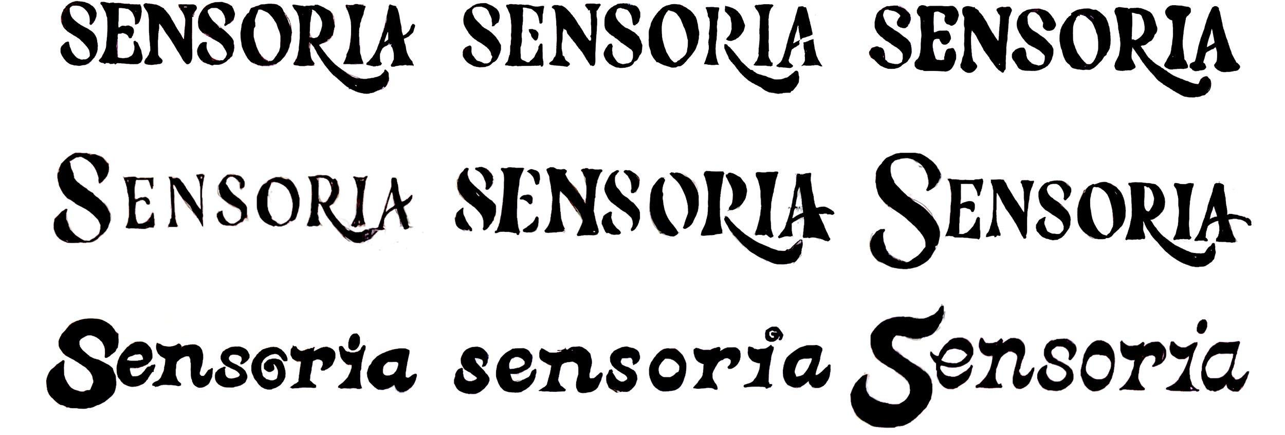
Sketches
Wordmark Creation
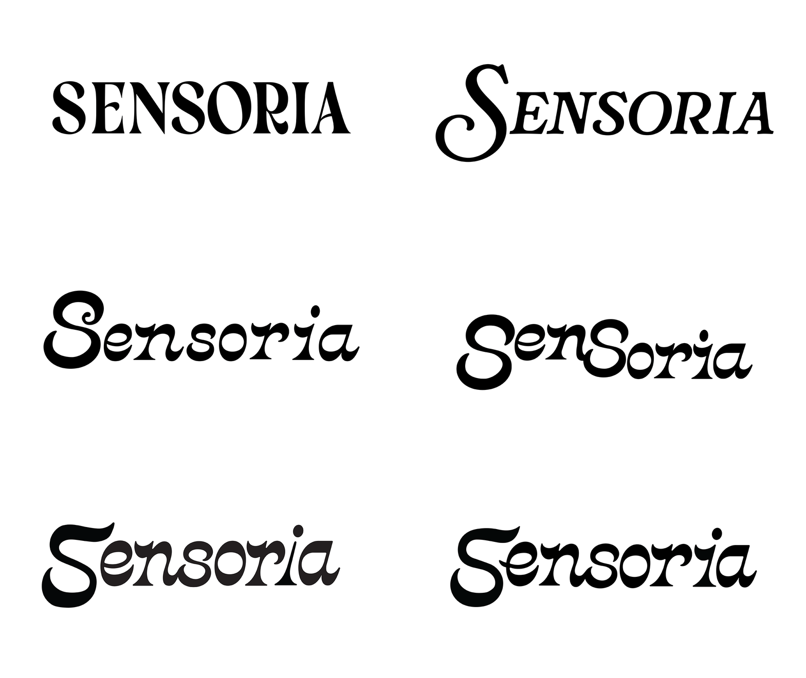
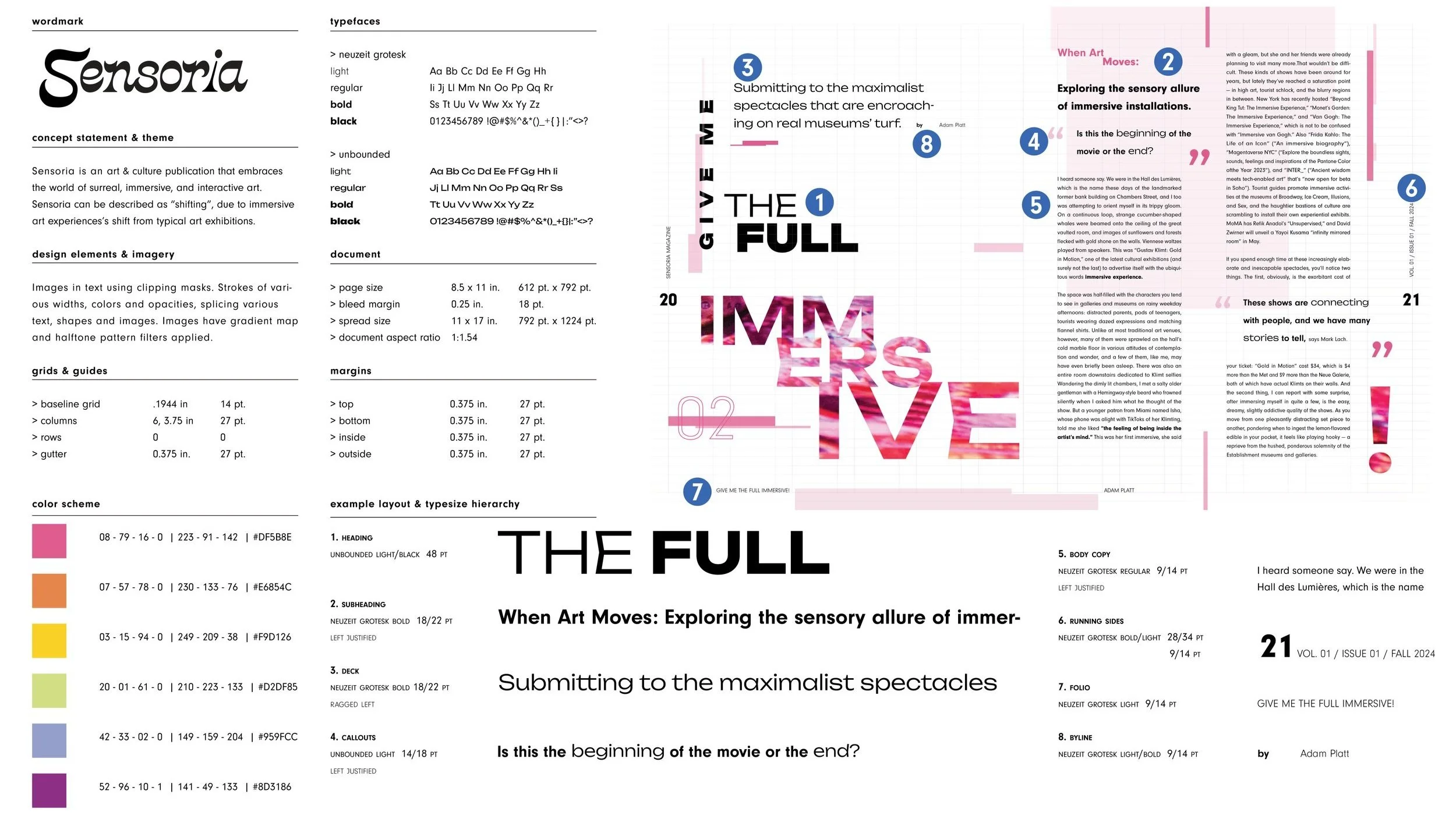
Sensoria’s wordmark is based on the typeface ‘Crayonette DJR’ created by David Johnathan Ross. Playing with extended strokes of letterforms as well as utilizing flourishes provided a visible difference from the original typeface.
static exclusive bland disengaged dated daunting
Digital Iteration
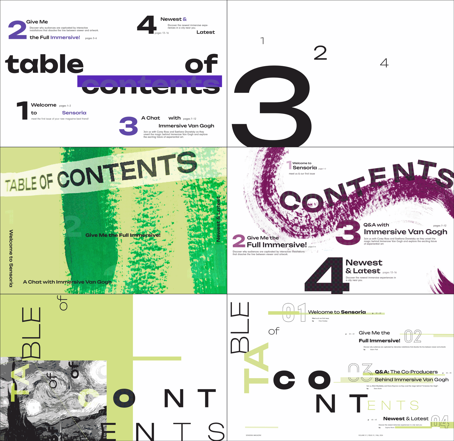
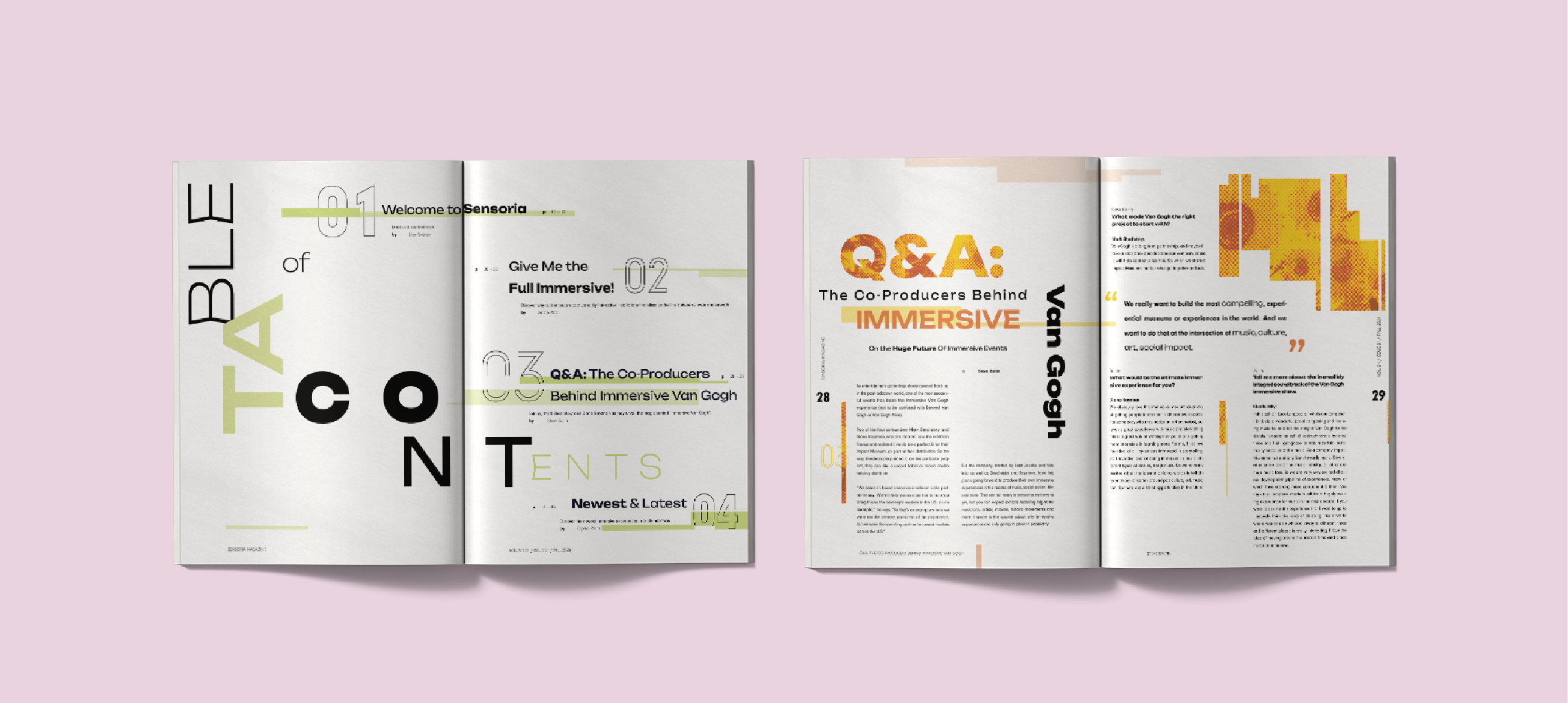
Table of Contents Process
Sensoria ISN’T…
Visual System & Layout
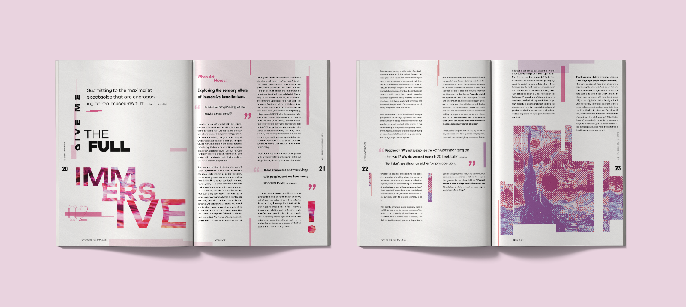
The publication was designed to adhere to a 6-column grid across an 11” x 17” spread, which in turn led to placement & aesthetic choices regarding type, imagery, & graphics.
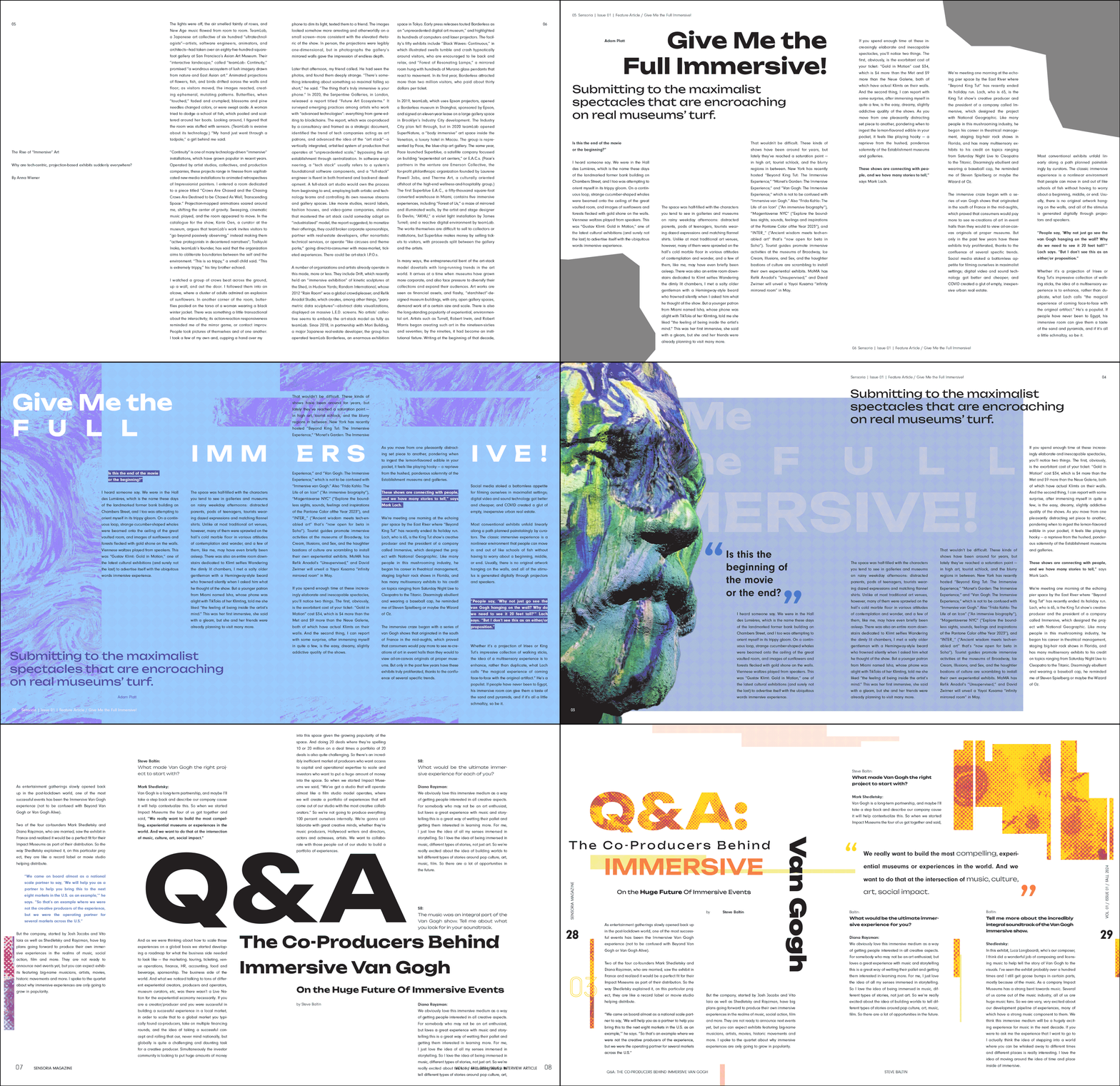
Feature Article & Interview Article Process


