

Sensoria Magazine
Typography | Publication Design | Wordmark Creation
Typography studio project focused on developing a multi-spread publication with its own custom wordmark. Typographic hierarchy and experimentation connect each spread to communicate the purpose of the publication and provide consistency.
Why?
As technology continues to evolve, artists and their mediums are expanding in new, innovative directions. This has brought the rise of immersive and multi-sensory art. Art isn’t just for viewing anymore. It’s about all of the senses. In recent years, famous painter Vincent Van Gogh’s legacy lives on through “Immersive Van Gogh”, which has caught the attention of a whole new generation of people.
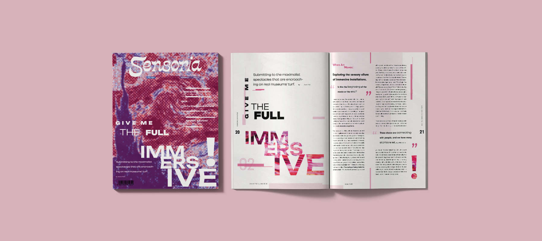
Sensoria aims to capture this shift in the art world by spotlighting artists who use immersive and sensory-driven experiences to push the limits of what is now possible. The publication explores how interactive and multisensory work is reshaping creative expression, placing audience participation, emotional impact, and innovation at the center of future artistic trends.
Conceptualizing
Defining what characteristics do and do not define Sensoria from the start ensures focus and consistency in design choices throughout the publication.
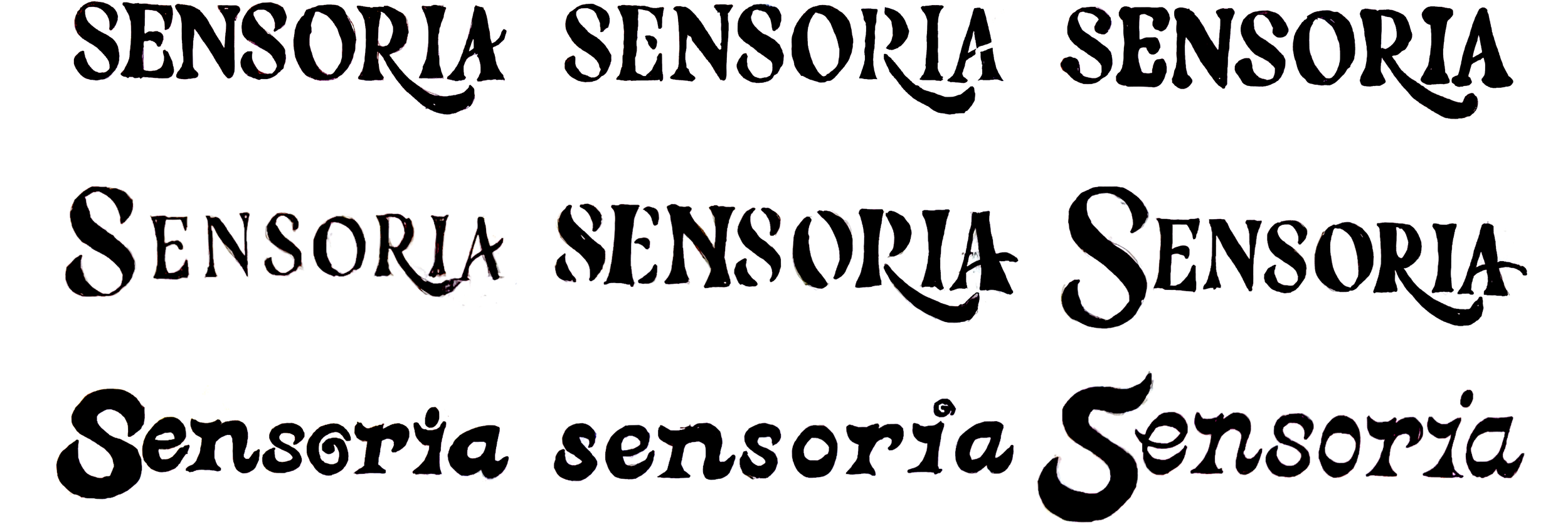
Wordmark Creation
Sketching
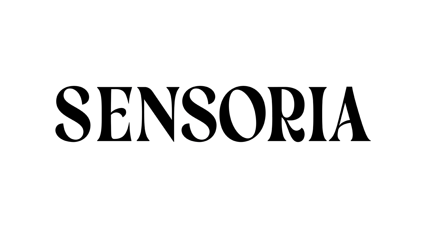
Digital Iteration
Sketches brought into Adobe Illustrator to further explore.
Visual & Layout System
The publication was designed to adhere to a 6-column grid across 11” x 17” spread, which lead to placement choices regarding type, imagery & graphics.
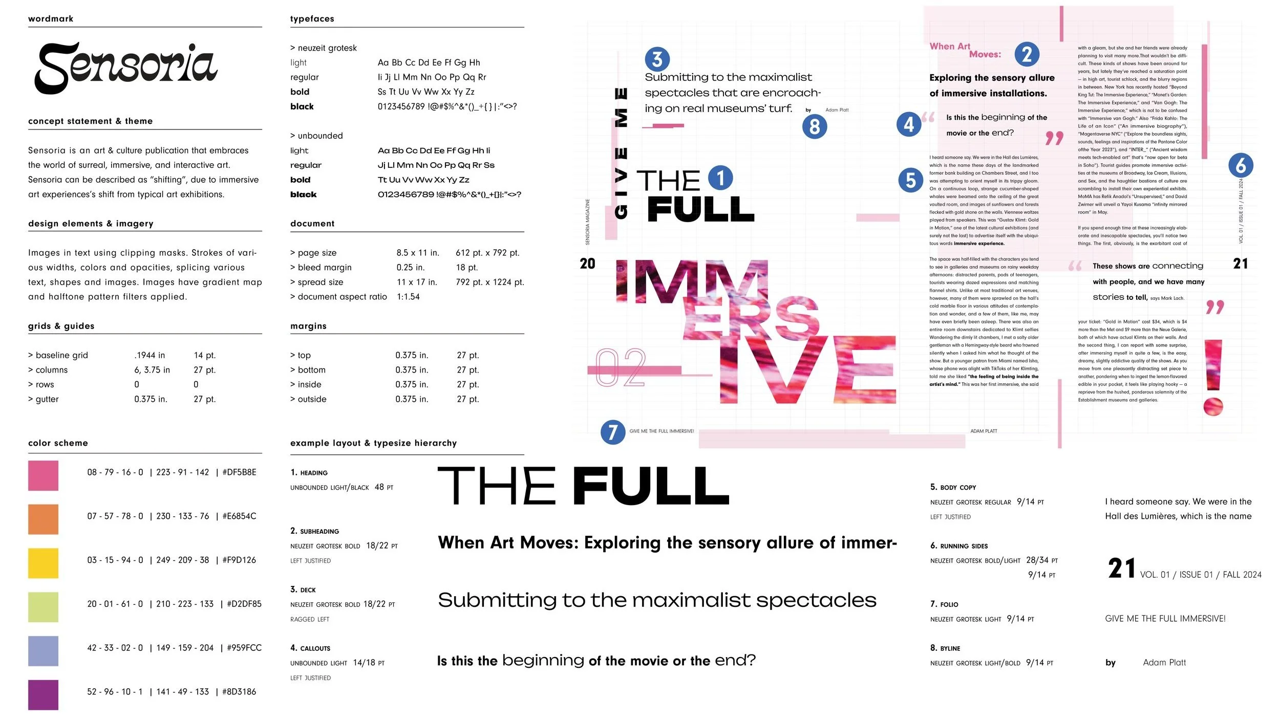
Visual & Layout System
Spread Creation & Experimentation
Ideation, experimentation and type play were a huge part of developing the publication’s table of contents, feature article, interview article & cover design.
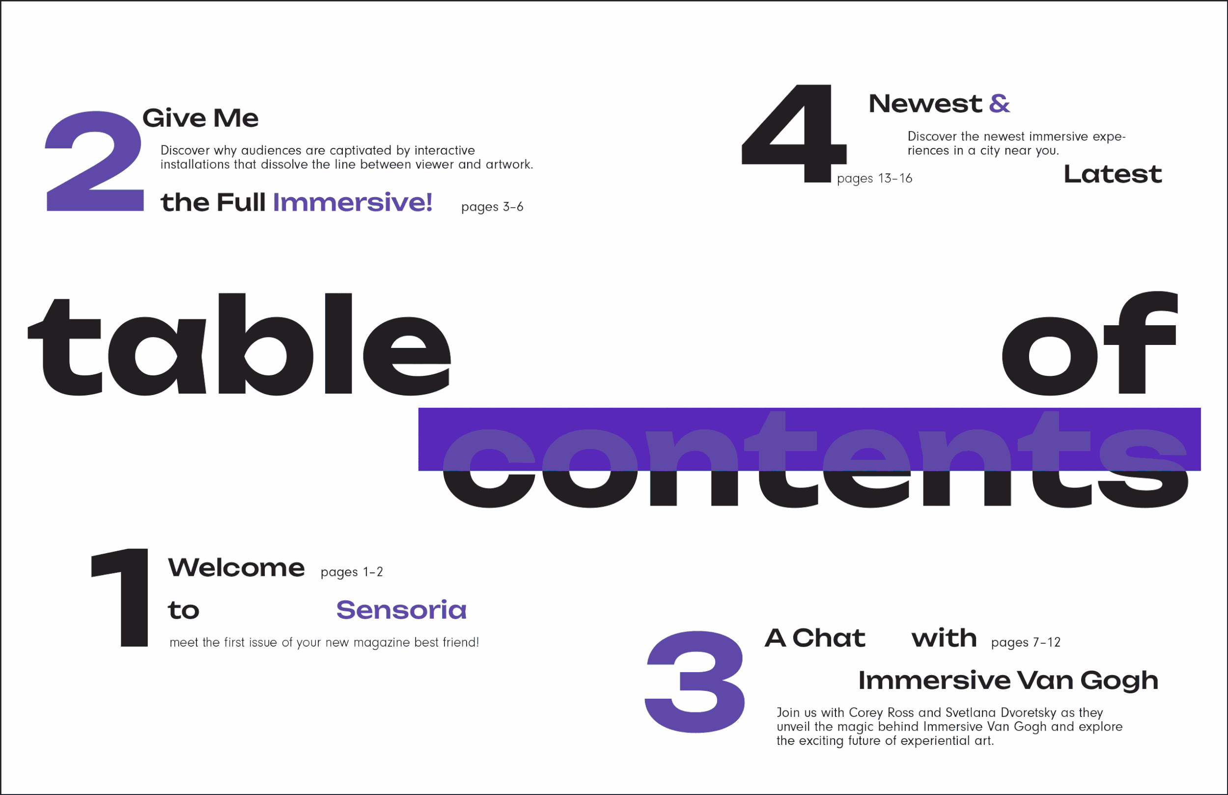
Table of Contents
Feature Article & Interview Article